
 New Design System
We’re introducing our New Design System, the single place where the CSS and styling elements of your websites will be managed effortlessly.
This new system brings a range of advantages that make the design-to-development process faster and more efficient. Some of the key benefits include:
- Cleaner L&D: All CSS on the site's design in a single place.
- Easily style your custom components using the utility classes you defined.
- Export Figma's design system: Instantly import the tokens you defined on Figma into L&D Tool's design system using our new plugin.
- Organized and Reusable Elements: Keep all your design elements in one place, making it simple to reuse them across different pages and sites.
The new Design System organizes styles into 6 main tabs: Breakpoints, Primitives, Fonts, Themes, Utilities and Elements:
- Breakpoints: Define responsive breakpoints in em or px for different screen sizes and devices.
- Primitives: Store all your design variables and values such as colors, spacing, typography etc.
- Fonts: Add any required fonts to your site by defining the font name, source, format, style, and priority.
- Themes: You can define multiple themes, set a default theme, and easily switch between them.
- Utilities: Utilities let you define reusable classes with specific properties and values, and organize them into groups
- Elements: Add and manage design elements, including child elements, variants, classes, and their respective properties.
Lets explore each one in detail
Breakpoints
Define responsive breakpoints in em or px for different screen sizes and devices.
- You can use numeric mode names (e.g., 320, 768px, 1024) for automatic naming.
- You can also use semantic names like mobile, tablet, or desktop.
Keep the number of breakpoints consistent , 3 to 5 breakpoints is generally recommended for a stable design structure.
Add a New Breakpoint
 You can add a new breakpoint by clicking the + icon and entering the breakpoint name and value. By default, the field will show the highest pixel value. Once you edit the value, the breakpoint will automatically reposition itself in the correct order.
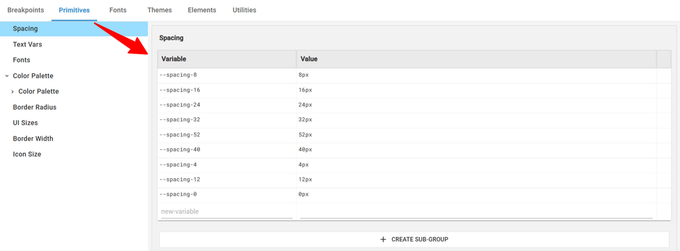
Primitives

Primitives tab is where you can add design variables and values such as colors, spacing, typography etc.
Adding a Group/Subgroup to Primitives
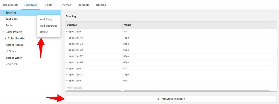
You can organize your variables by creating groups and subgroups,which are arranged in parent-child format under the right menu . By default, the system starts with a single group named “Group 1.” You can add new groups from the left panel or use the three-dot menu on any group, which provides options to create a group, create a subgroup, or delete an existing one.
Primitives must follow a strict structure to ensure clean and consistent variable generation.
- Each variable must use a literal value, such as an exact color code or number because variable-to-variable references are not allowed in primitives.
- A primitive can contain only a single value, so multi-column or multi-value modes aren’t supported.
- All variables should follow the naming format Collection/Group/--variable-name. If your color palette contains repeated names, the plugin will automatically simplify them. Example: If your palette includes color palette/white/--white, it will not convert to --white-white; instead, it will simply generate --white.
Fonts
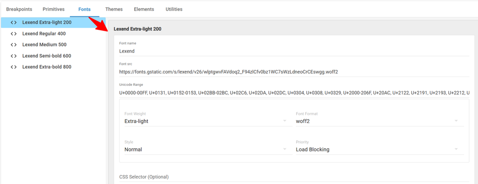
Add any required fonts to your site by defining the font name, source, format, style, and priority.
Font Name: Assign any name you want to your font.
Font Source: Add the URL where the font file is hosted.
Unicode Range: Specify the character range your font should support.
Font Weight: Choose the font’s thickness from options like thin, medium, bold, etc.
Font Style: Select the style such as normal, italic, or bold.
Font Format: Pick the file format like WOFF, WOFF2, OpenType, or TTF.
Font Priority: Choose whether the font loads in an optimized (lazy load) or load-blocking.
CSS Selector (Optional): Add a custom CSS selector if you want the font applied to specific elements.
Themes
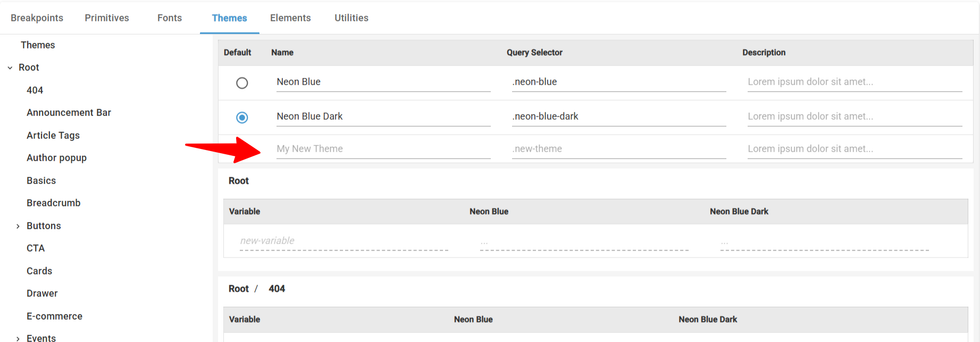
You’ll also see a radio button next to each theme, which lets you choose which theme should be the default or switch between the themes.
When CSS is generated, the variables for the default theme will apply in two cases:
- when no theme class is applied, and
- when the default theme’s class is applied to an element.

Each theme is displayed in vertical columns, allowing you to easily select different values for each variable. For example, in the screenshot below, the Neon Blue and Neon Blue Dark themes appear side by side so you can assign separate values for the same variable across themes.

The navigation sidebar displays both Themes and Root entries. When you click the three dots next to any entry, you’ll see a dropdown with options to create a new subgroup. Each Theme can contain multiple groups, and those groups can also have their own subgroups.

Elements
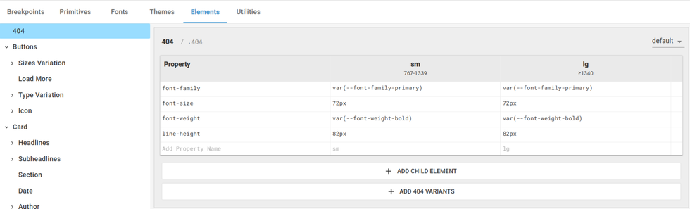
Elements tab is where users will define the elements and their variations used in the design. Add and manage design elements, including child elements, variants, classes, and their respective properties.
How to create an New Element?
Step1: Click on Add Element.

Step 2: You can edit the Element name and CSS class by just clicking on it.
Step 4: You can define properties and values for each element, and every breakpoint will appear as a separate column.
Step 5: Select the State of the element from the dropdown in the top-right corner. Default is always selected by default for any element.
Changing the State dropdown shows the values set for each property in the element for the selected state.

You can add child element to an element by clicking “+Add Child Element”
You can add new property to the element by clicking on “+ Add Variant”

Utilities
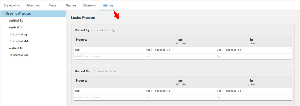
Utilities generate reusable classes that can be applied to any elements or custom components. For example, padding-top and padding-bottom settings can be grouped under a vertical space utility class, allowing you to easily apply consistent spacing wherever needed.
How to Add Utility?
You can add a new utility by clicking “+ Add Utility.” From there, you can update the utility’s name and the CSS class associated with it. It will add blank property fields where you can define the CSS properties and their values for each breakpoint.

You can organize your utilities into groups and subgroups—or delete them—by clicking the three dots next to the utility name in the navigation panel. The dropdown will display all available options.
How to Import Your First Figma File?
Step 1: Build your design system & make sure the design system in Figma and follow our Guidelines.
Step 2: Install the RebelMouse Plugin for Figma.
Step 3: Open your Figma file and extract the CSS using the RebelMouse Design System Extractor plugin.

Step 4: Resolve any warnings or errors that appear

Step 5: Copy the generated CSS
Step 6: In the Layout & Design Tool, open the Design System from the hamburger menu.

Step 7: Click the three dots on the live test in the top-right corner to see the options. Click on “Import Design System from Figma”.

Step 8: Paste the copied XML into the field provided and click Add a New Design.

All your Figma design data will be organized into five tabs within the new AB test in Design System: Breakpoints, Primitives, Themes, Utilities, and Elements.
Export your Designs into a Figma File
Step 1: Click the three dots on the AB test in the top-right corner to see the options. Click on “Import Design System from Figma” the entire design system is copied to your clipboard in XML format.

Step 2: Go to your Figma, right-click on the Designs and open the RebelMouse Extracter Plugin. Click on Import and You can then import this XML code into Figma.
How to Set a AB test live?
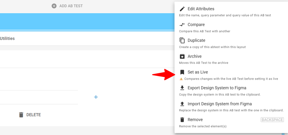
When you click Set AB Live, a comparison view opens showing the current live version alongside your A/B test. Review the updates, and once you’re happy, save the changes to push the new designs live.
How to test your updates?
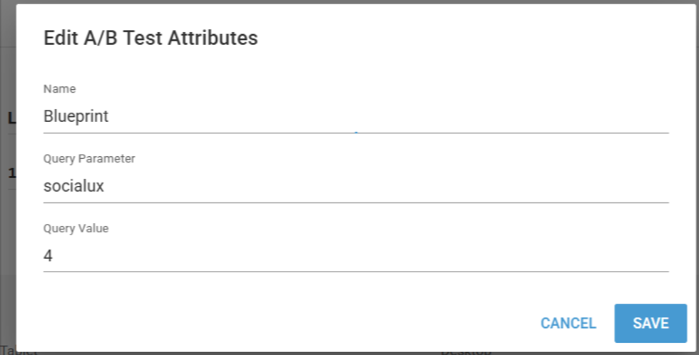
You can update the name, query parameter, and query value for your A/B test by clicking Edit Attributes. To verify the designs on your site, simply add the query parameter to the page URL and load it in your browser. This allows you to test the changes instantly. For example: ?socialux=4
Other Options - Compare, Duplicate and Archive
Compare – Works just like our standard A/B tests. You can use the compare option to review the changes between AB tests.
Duplicate – Creates a new A/B test with the same as original.
Archive – Moves the A/B test into the archive.Table of Contents
- Breakpoints
- Add a New Breakpoint
- Primitives
- Adding a Group/Subgroup to Primitives
- Fonts
- Themes
- Elements
- How to create an New Element?
- Utilities
- How to Add Utility?
- How to Import Your First Figma File?
- Export your Designs into a Figma File
- Step 2: Go to your Figma, right-click on the Designs and open the RebelMouse Extracter Plugin. Click on Import and You can then import this XML code into Figma.
- How to Set a AB test live?
- How to test your updates?
- Other Options - Compare, Duplicate and Archive


© 2026 RebelMouse. All rights reserved.
Comments Moderation Tools