
Our improvements to Layout & Design Tool - Components 2.0 - allow you to pass entire HTML structures, other components, and complex nested content directly into your components. Think of it as the difference between a basic template and a sophisticated content management system - but for individual web components.
Key Benefits
Components 2.0 addresses solutions to limitations, such as:
- Enhanced Property Management: The prop logic supports various input types, including color pickers, image croppers, dropdowns, and boolean checkboxes.
- Streamlined Development Workflow: Components can now receive entire HTML structures with custom markup as input through their slot system, allowing for precise control and prototyping when needed, while maintaining the visual editing experience for everyday use.
- Visual Slot Management: Slots appear as distinct, manageable elements in the interface, with clear visual indicators that make it easy to understand where content can be inserted and modified.
- Multiple Styling Options: With the new skin system, you can define multiple visual appearances for the same component.
- Scalable Architecture: Components 2.0 ensures your components will remain relevant and maintainable as web technologies evolve.
How to Build Your First Component
Step 1: Create a New Component
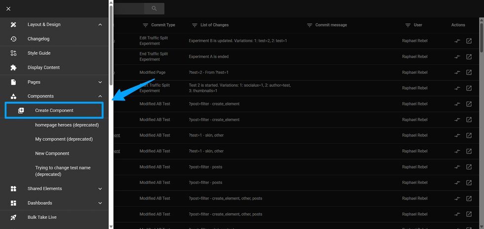
In the Layout & Design Tool page, navigate to the Create Component option and select the v2.0 option (this should be selected by default). Unlike v1.0 components, your new component will use the enhanced architecture that supports slots and multiple skins.
Important: v1.0 will remain manageable until December 2025. After this period, existing v1.0 components will continue to be supported, but no modifications or new v1.0 components will be allowed.
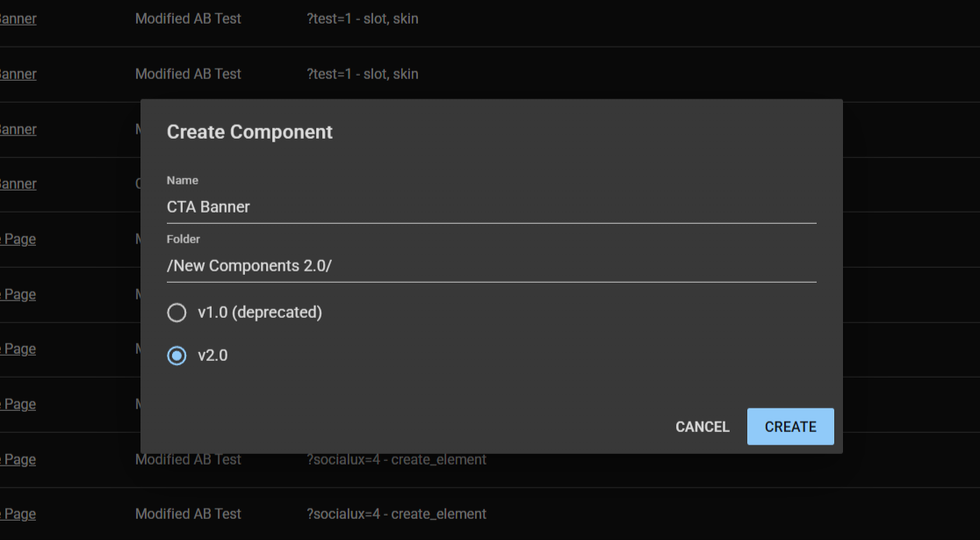
Popup for creation
Note: Currently, components v1.0 are deprecated.
Step 2: Define Your Component Properties (Props)
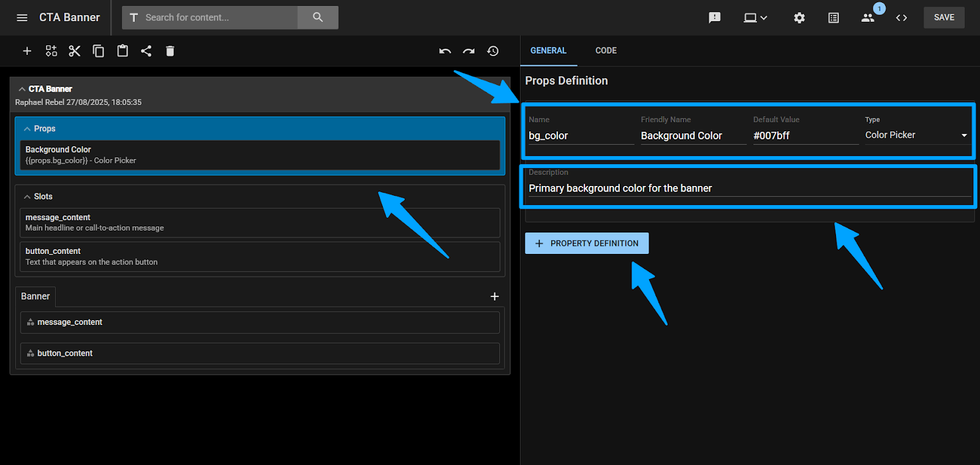
Click on the "Props" section in the Inspector. Here you'll define the customizable parameters for your component. For each property, specify:
- Name: A technical identifier used in code (e.g., "primary_color")
- Friendly Name: The user-facing label (e.g., "Primary Color")
- Type: Choose from 1 of the following types:
- Text input
- Checkbox
- Numeric Input
- Numeric Stepper
- Dropdown
- Cropped Image URL
- Color Picker
- Default Value: Set a fallback value that will be used if not changed.
- Description: A helpful guide that will appear in tooltips when using this component.
- + Property Definition: A button to create more props in the same component. Once clicked, it will create a new prop with all the fields described above to fulfill.
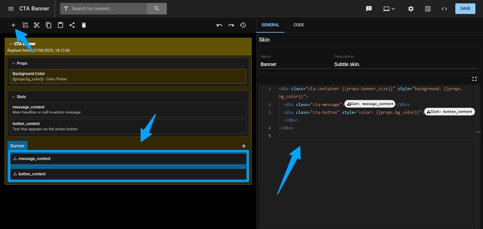
Step 3: Create Content Slots
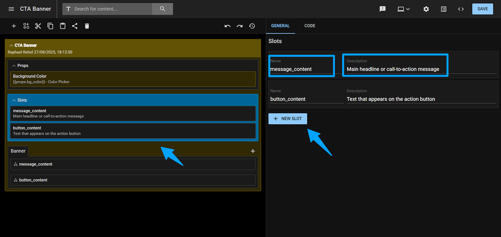
Select the Slots section to define areas where custom content can be inserted. Each slot acts as a placeholder that can accept HTML, other components, or shared elements under it, which will be explained later. Configure each slot with:
- Name: A clear identifier for the content area (e.g., "hero_content", "sidebar").
- Description: Explain what type of content belongs in this slot.
- + New Slot: A button to create more slots in the same component. Once clicked, it will create a new slot with all the fields described above to fulfill.
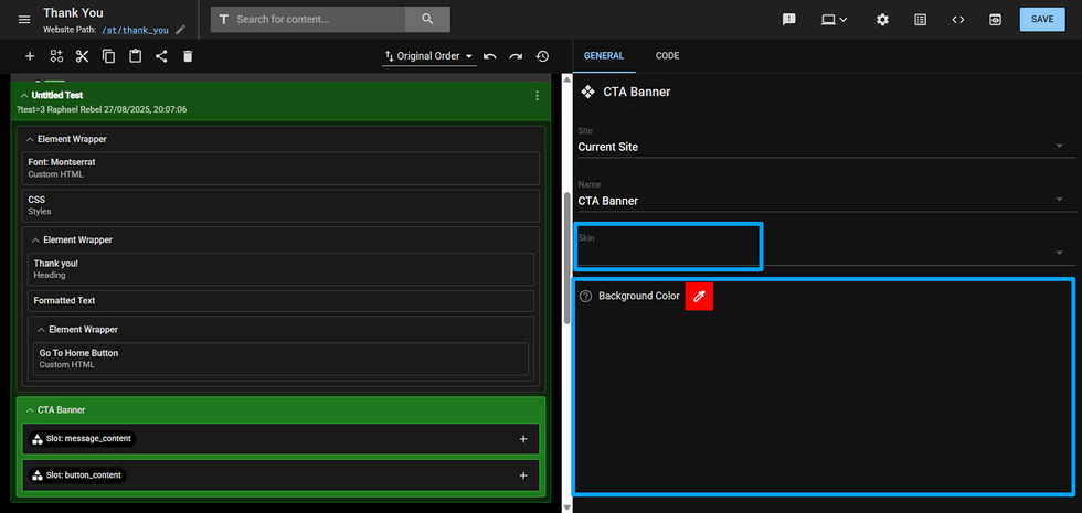
Step 4: Design Your Component Skins
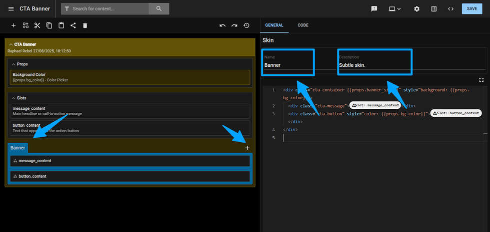
In the "Skins" section is where the magic begins. You can create different visual variations of your component using raw HTML code. Each skin defines how your component appears and behaves.
To start, you will set a default skin and then add alternatives for different use cases. Each skin includes:
- Name: A descriptive identifier (e.g., "card_layout", "hero_banner")
- Description: Brief explanation of when to use this skin
- A “+” button to add a new skin in the same component
Step 5: Build Your Skin Templates
Select a skin on your component. On the right tab inspector, you will see a raw HTML code field. This is where you'll define the actual structure and styling of your component. Use the editor to:
- Write standard HTML markup for your component structure.
- Insert slots where you want the content to appear.
- Reference properties using the defined prop names.
- Include other L&D elements or components as needed.
Step 6: Test Your Component Reference
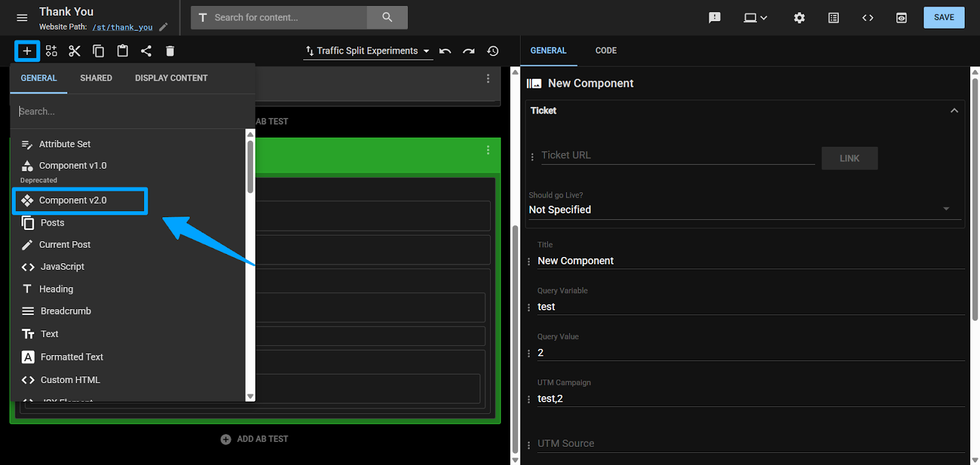
On another page, shared element or component layout, create a new instance of your component by selecting it on the “+” Add element button. You will be given a dropdown to select the component you want by its name.
Component Name Dropdown Select
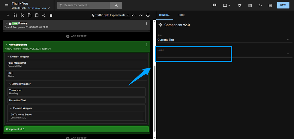
After selecting from the dropdown, you will see in the inspector on the right side:
Component Props and Skin Select
- A skin dropdown to choose which visual variant to use. Those skins are previously created on the component page.
- Individual input fields for each property you defined (color pickers, text fields, checkboxes, etc.).
- Slot elements in the Inspector on the left side, with + buttons to enable them. By default, slots are disabled.
- You can also nest custom content in each slot once enabled, such as other components or shared elements.
Step 7: Customize Slot Content
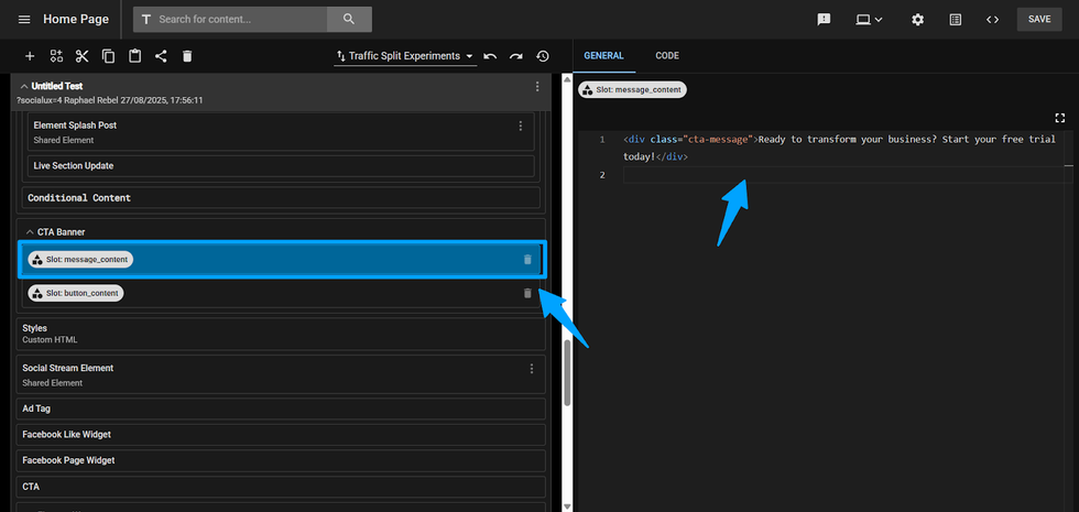
Click the + button next to any slot to enable it, then select the slot. You can now add custom HTML, other components, or shared elements directly into that slot using the Raw HTML Code editor.
Adding Elements and Components Under Slots
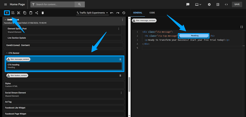
Table of Contents
- Key Benefits
- How to Build Your First Component
- Step 1: Create a New Component
- Popup for creation
- Step 2: Define Your Component Properties (Props)
- Step 3: Create Content Slots
- Step 4: Design Your Component Skins
- Step 5: Build Your Skin Templates
- Step 6: Test Your Component Reference
- Component Name Dropdown Select
- Component Props and Skin Select
- Step 7: Customize Slot Content
- Adding Elements and Components Under Slots


© 2026 RebelMouse. All rights reserved.
Comments Moderation Tools