

Collection Structure
Your Figma file should contain four types of variable collections. The plugin automatically detects collection types based on their names:
| Collection Type | Naming Requirement | Purpose |
|---|---|---|
| Primitives | Any name not including theme, element and utilit (e.g., “Color Palette”, “Spacing”, “Typography”) | Base design tokens with literal values |
| Theme | Must include “theme” (case-insensitive) | Semantic tokens with different modes (e.g., light, dark) |
| Elements | Must include “element” (case-insensitive) | Component-specific CSS with breakpoints |
| Utilities | Must include “utilit” (case-insensitive) | Utility CSS classes |
Variable Naming Conventions
All variable names across all collections must follow these strict naming rules:
Required Format
- Must start with
--(double dash). - Allowed characters: lowercase letters only (a–z), numbers (0–9) and hyphens (-).
- Uppercase letters, spaces, underscores and other special characters are not allowed.
Naming Do's and Don'ts
| ✓ DO | ✗ DON'T |
|---|---|
--surface-primary-text | surface-primary-text (missing --) |
--button-background-color | --Button-Background-Color (uppercase) |
--spacing-4 | --spacing_4 (underscore) |
--primary-500 | --primary#500 (special char) |
--font-size-lg | --Font Size Large (spaces) |
1. Primitives Collection
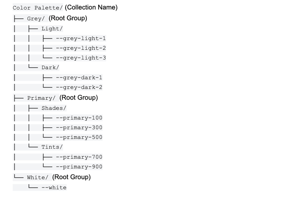
Contains base design tokens with literal values (colors, spacing, typography, etc.). These are the foundation of your design system.
Key Rules
- Literal values only — no variable references (aliases) allowed.
- Single mode only — primitives should have only one mode (no breakpoints/themes).
- Collection naming — any name that doesn't include “theme”, “element” or “utilit”.
Primitives Do's and Don'ts
| ✓ DO | ✗ DON'T |
|---|---|
Use literal color value: rgb(51, 102, 204) or 16px | Reference another variable: var(--blue-500) or var(--ver-gap-sm) |
| Keep single mode (one column) | Add multiple modes for variations |
Use semantic names: --primary-500 | Use arbitrary names: --color-1 |
Tip: For color palettes with repeated names, the plugin automatically cleans them. For example, Color Palette/White/--white will export as just --white, not --white-white.
2. Theme Collection
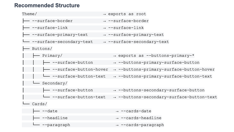
Contains semantic tokens that reference primitives or other theme variables. Themes support multiple modes like Light & Dark, Default & High Contrast or any other variations. These can be applied on the page level or on elements level depending on the implementation.
Key Rules
- Collection name must include “theme” — case-insensitive (e.g., Theme, Themes, MyTheme all work).
- Variables should reference primitives — don’t hardcode values in themes.
- Collection modes will be the different themes — the first mode (leftmost column) in the collection is the default theme.
- Group prefixes added automatically — e.g.,
Theme/Cards/--datebecomes--cards-datein export. - Variables at ROOT level (directly under
Theme/) export without group prefix — e.g.,Theme/--variablebecomes just--variable.
Theme Do's and Don'ts
| ✓ DO | ✗ DON'T |
|---|---|
Reference primitives: {primary-500} | Hardcode values: rgb(51, 102, 204) |
Use descriptive modes: light or dark | Use meaningless modes: theme1, theme2 |
| Organize into logical groups (e.g., Buttons, Cards) | Put all variables at root level without groups |
| Put default theme (e.g., Light) as first mode | Put secondary theme as first mode |
3. Elements Collection
Contains component-specific variables (buttons, cards, forms, headlines, etc.) with responsive breakpoint support. Each variable must be a valid CSS property.
Key Rules
- Collection name must include “element” — case-insensitive.
- Modes define breakpoints — use numeric format for automatic naming.
- Variables must be valid CSS properties — like
--font-size,--color,--padding. - Root elements with children should have properties — e.g.,
Button/should have--background-color, not just children.
3.1. Element (Root Level)
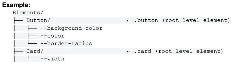
Definition: Any folder at the first level directly under the Elements collection.
Rules:
- Should have CSS properties defined.
- Generates CSS class:
.element-name.
3.2. Element (Child - Variant)
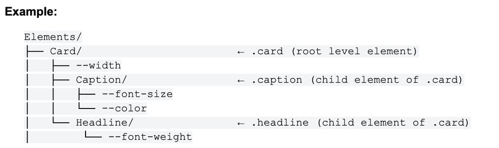
Definition: A folder inside an element that HAS CSS properties.
Rules:
- Has CSS properties
- Is a child of a Variant Group
- Generates &.variant-name CSS class (nested inside parent element)
- Cannot have child groups (must be leaf node)
CSS Nesting Explanation:
- The & represents the parent element's class
- &.small inside .card compiles to .card.small
- This creates modifier classes that must be used together with the parent
3.3. Variant group
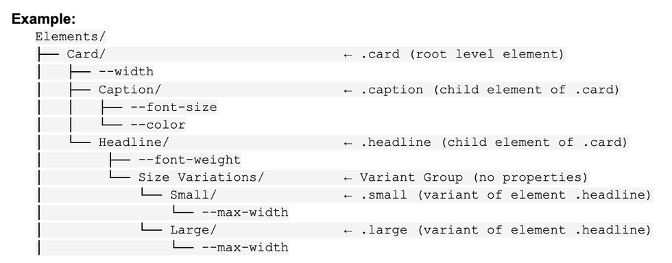
Definition: A folder that has NO CSS properties and exists only to organize child elements.
Rules:
- Has no CSS properties itself.
- Contains child folders that are child elements (have properties).
- Purpose: organizational container only.
- Exports as
<variant>(not a CSS class).
Elements inside Variant groups will create specific css class that needs to be used together with parent element class
Variant CSS Nesting Explanation:
- The & represents the parent element's class
- &.small inside .headline compiles to .headline.small
- This creates modifier classes that must be used together with the parent (html example below)
HTML Example:
<div class=”card”>
<div class=”caption”>
Some caption
</div>
<div class=”headline small”>
Headline
</div>
</div>
3.4 Complete Example with All Three Types
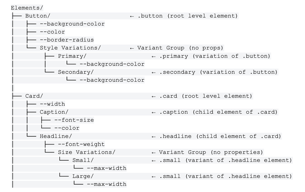
Key Rules Summary
| Type | Has Props? | Has Children? | Location | Exports As |
|---|---|---|---|---|
| Element (Root) | Should have | Can have | Root level only | <selector query=".name"> |
| Element (Child - Variant) | Yes | No (leaf) | Any level | <selector query="&.name"> |
| Variant Group | No | Yes | Nested only | <variant name="..."> |
Critical rule: Selectors with CSS properties cannot have child groups. If a folder has CSS properties, it must be a leaf node. Use Variant Groups (folders without properties) to organize multiple Element (Child) variations.
HTML example of how classes will be used

Structure Do's and Don'ts

Breakpoint Modes
Breakpoints are defined by the modes (columns) in your Elements collection. The plugin processes mode names based on their format.
Numeric Mode Names (Recommended)
Format: #### or ####px (e.g., 480, 768px, 1024).
When all mode names follow this numeric format, the plugin:
- Extracts the pixel value from each mode name.
- Assigns a standard breakpoint name based on the column position and total number of columns.
The standard names assigned depend on how many modes (columns) you have in the collection:
| Columns | Example Mode Names | Assigned Names |
|---|---|---|
| 2 | 320, 768 | sm, lg |
| 3 | 320, 768, 1024 | sm, md, lg |
| 4 | 320, 768, 1024, 1440 | xs, sm, md, lg |
| 5 | 320, 768, 1024, 1440, 1920 | xs, sm, md, lg, xl |
| 6 | 320, 768, 1024, 1440, 1920, 2560 | xs, sm, md, lg, xl, xxl |
Example: If your Elements collection has 4 modes named 480, 768, 1024, 1440:
- First column (480) → exports as
xswith value 480. - Second column (768) → exports as
smwith value 768. - Third column (1024) → exports as
mdwith value 1024. - Fourth column (1440) → exports as
lgwith value 1440.
Mixed or Custom Mode Names
If mode names are NOT all numeric (e.g., mixing “mobile” with “768”):
- Numeric modes: plugin extracts the value and assigns position-based standard name.
- String modes: plugin keeps the original name but the value field will be empty (needs manual input in the exported XML).
Pseudo-State Suffixes
The plugin supports CSS property names with pseudo-state suffixes:
-hover→ exports as&:hover-active→ exports as&:active-focus→ exports as&:focus-disabled→ exports as&:disabled-visited,-checked,-required,-invalid,-valid
Example: --background-color-hover is a valid property that will export with :hover selector.
Elements Do's and Don'ts
| ✓ DO | ✗ DON'T |
|---|---|
Use valid CSS: --font-size, --padding | Use invalid: --headline-style, --main-area |
Give root elements properties: Button/--background-color | Leave root elements empty with only children |
Use numeric breakpoints: 480, 768px | Mix styles: 480, tablet, 1024 |
| Reference theme variables for colors | Hardcode colors directly |
| Use consistent breakpoints (3–5 recommended) | Use too many breakpoints (>6) |
4. Utilities Collection
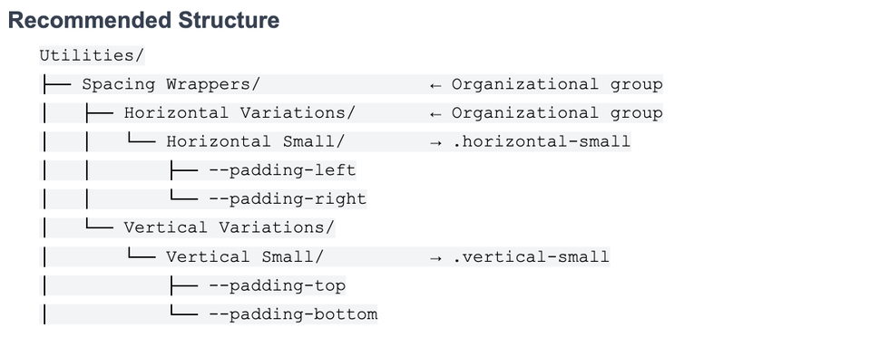
Contains utility classes and their CSS properties. Each final selector must be unique across the entire collection.
Key Rules
- Collection name must include “utilit” — case-insensitive (e.g., Utilities or Utility both work).
- Variables must be valid CSS properties — same rules as Elements.
- Selector names must be unique — no duplicate variable names anywhere within the collection.
- Organizational groups don't generate CSS — folders without CSS properties are purely for organization in Figma and don't affect the exported XML. Only folders with CSS properties become selectors with class names.
Utilities Do's and Don'ts
| ✓ DO | ✗ DON'T |
|---|---|
| Use unique selector names throughout. | Duplicate names: Container/Small + Wrapper/Small. |
Use valid CSS on variables: --width, --max-width. | Use custom names: --container-size. |
| Descriptive group names: “Large Container”. | Generic names: “XL”, “1”. |
| Use organizational groups (no properties). | Create empty selectors with no CSS. |
Important: selector class names are derived from folder names. A folder named “Small” becomes .small. If you have two folders named “Small” anywhere in the Utilities collection, you'll get a duplicate class warning.
Valid CSS Properties Reference
Variables in Elements and Utilities collections must use valid CSS property names.
Quick Checklist
Before exporting your design system, verify all of the following:
Collection Names
- Primitives collection exists (any name not matching theme/element/utilit).
- Theme collection name includes “theme” (case-insensitive).
- Elements collection name includes “element” (case-insensitive).
- Utilities collection name includes “utilit” (case-insensitive).
Variable Names
- All variables start with
--. - All variables use lowercase letters only.
- All variables use hyphens (not underscores) to separate words.
- No special characters except hyphens.
Primitives Collection
- All variables have literal values (no variable references).
- Only one mode exists (single column).
Theme Collection
- Variables reference primitives using Figma's alias feature.
- First mode is the default theme (Light).
- All modes have values for all variables.
Elements Collection
- Mode names are numeric (320, 768px, 1024) or semantic strings.
- 2–6 breakpoint modes defined.
- Variables are valid CSS properties.
- Root elements with children have CSS properties.
Utilities Collection
- Variables are valid CSS properties.
- Selector names are unique across the entire collection.
- No empty selectors (each must have at least one CSS property).
Common Issues and Solutions
Issue: Using base or wrapper inside Elements in Figma

Solution: Instead of using base place all default values directly to Breadcrumbs. This will eliminate the need to use double classes on parent elements.
Instead of:

We will do this:


Issue: Unintentional variations instead root props

Creating an empty group inside an element will create variations. If you want to avoid that reconsider your collection organization.
Solution: Add container variables to root element and move header to a child element.

Issue: Using variations instead of child elements

Be sure which type you want to use, child element or variation.
With current setup you would need to do following on frontend:

Solution: This should be child elements under Breadcrumb root element:

This will allow you to use child elements on frontend:

Issue: Utility inside elements

Solution: Please separate elements from utilities. The key question: is this a specific UI component (element) or a reusable style that can be applied to any element (utility)? In this case, since gap controls spacing between elements and can be applied anywhere, it belongs in the utilities collection.

Issue: Breakpoints not generating correctly
Solution: Check that:
- Breakpoints are defined in the Elements collection (not Theme or Primitives).
- Mode names follow numeric format (320, 768px) or are custom strings.
- You have 2–6 breakpoint modes.
Issue: Invalid CSS property warnings
Solution: Variables in Elements and Utilities must be valid CSS properties. Change custom names like --card-style to valid CSS like --background-color or --font-size.
Issue: Empty element warnings
Solution: Root elements that have children should also have CSS properties. For example:
Solution: Root elements that have children should also have CSS properties. For example:
- Wrong: Button/ (empty) → Other Variations/ → Load More/ → --width
- Right: Button/ → --background-color, --color + Other Variations/ → Load More/ → --width
Issue: Duplicate utility class warnings
Solution: Each utility selector must have a unique name. If you have “Container/Small” and “Wrapper/Small”, both generate .small. Rename one to be unique.


