Latest Stories
Documentation
Display Content for RebelMouse
What is Display Content and Why It Matters?
RebelMouse's Layout and Design tool is highly flexible, enabling developers and non-technical users alike to create new design and functionality elements using drag-and-drop Display Content. However, websites typically share common building blocks such as text, images, and logos that appear in various placements across the site.
These essential elements shouldn't be buried in the code. Instead, they should be easily accessible for non-technical users to change them effortlessly. Designers, product managers, and other non-technical users often need to update simple features and design styles without diving into the code.
This is where Display Content come into play. Display Content allows for creating a single source of truth for display content. Marketers and editorial teams can manage basic texts, images, and even HTML in a reusable way, ensuring consistency across the site. Moreover, these display content items are simple for non-technical users to edit, making it easy for everyone involved to maintain and update the site’s content.
Let's take a look at how it works.
How to Enable Display Content for your site?
Display Content elements are already enabled by default for any site.
How to access Display Content elements?
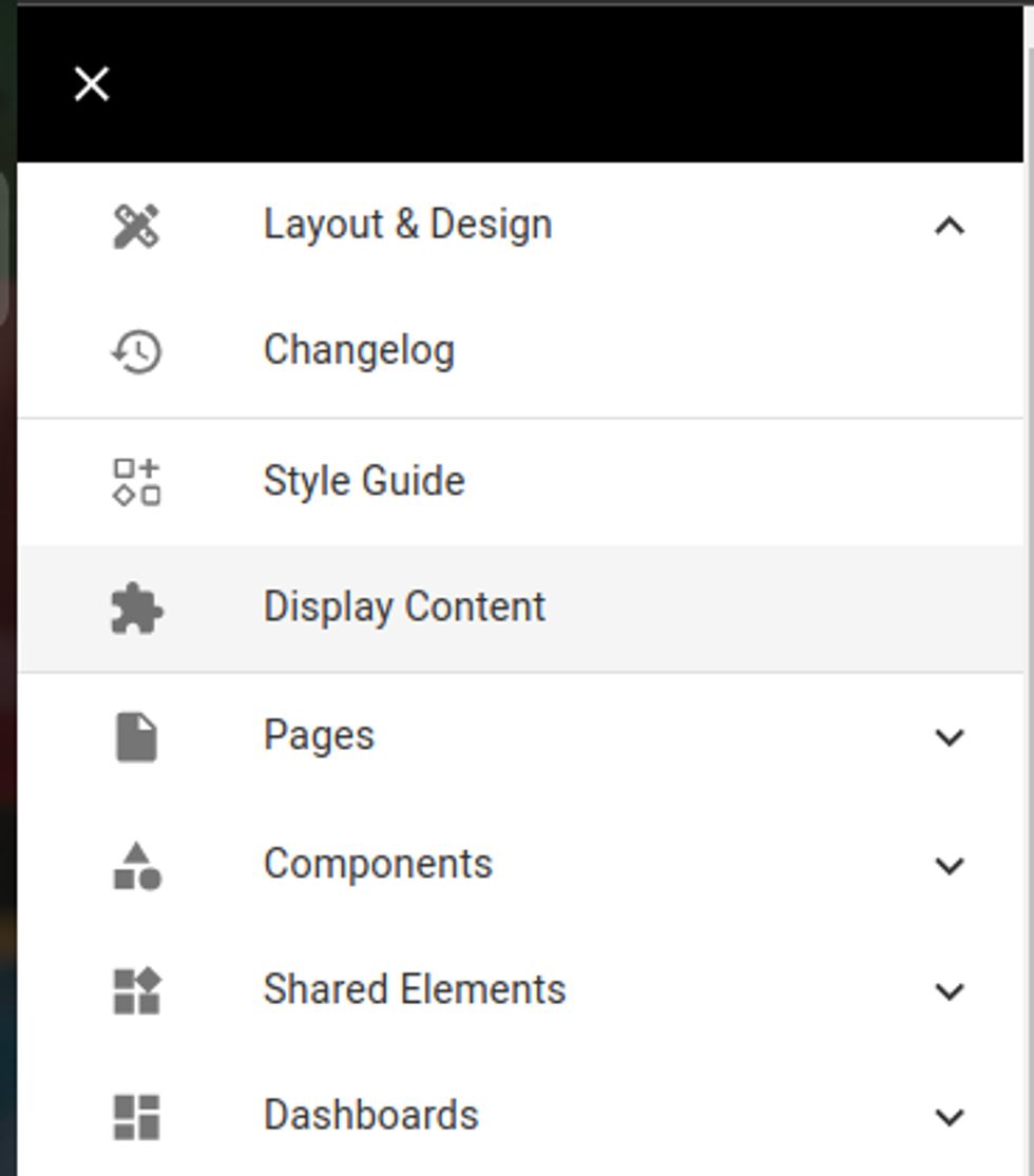
On the Layout and Design menu there is a Display Content link to the dashboard where you can configure display content elements:
This is how the dashboard looks like:
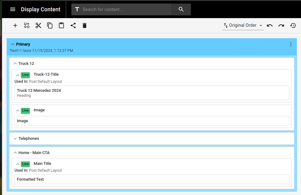
You will be able to add/edit/delete display content elements as you wish and we will explain a little below how they work.
Wrappers or Grouping
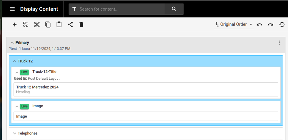
Before adding any display content element, you have the option to create a Grouping around the display content elements you want to organize.
These wrappers (or groupings) help keep your content organized. You can rename them to anything you like, such as in the example above where a wrapper called "Truck 12" that groups all the content for this specific Truck:
Defining Display Content Elements
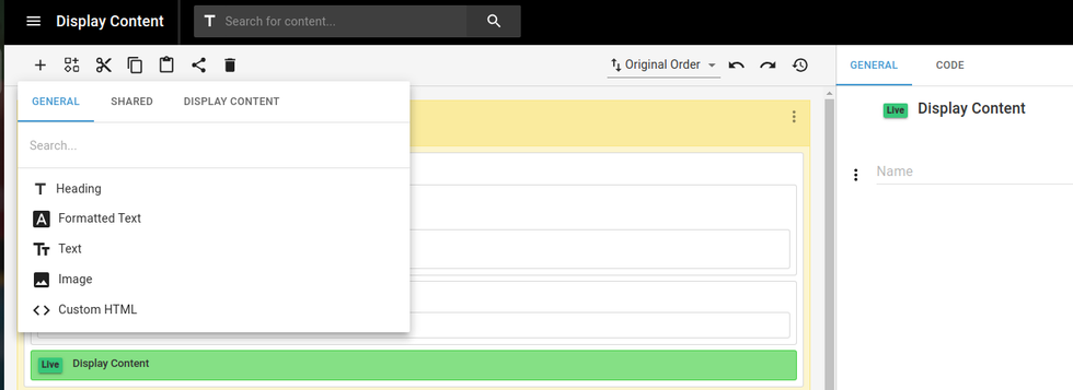
Inside the Variables Element and inside a grouping you are able to add/edit/delete display content elements. Types of Display Content elements:
- Heading
- Formated text
- Text
- Image
- Custom HTML
Define Values for Display Content Types

Here we have the grouping Truck 12, that contains 2 display content elements in it:
Truck-12-Title, that contains a Heading with value Truck 12 Mercedez 2024
Image, that contains an image of a Truck
Using Display Content Elements
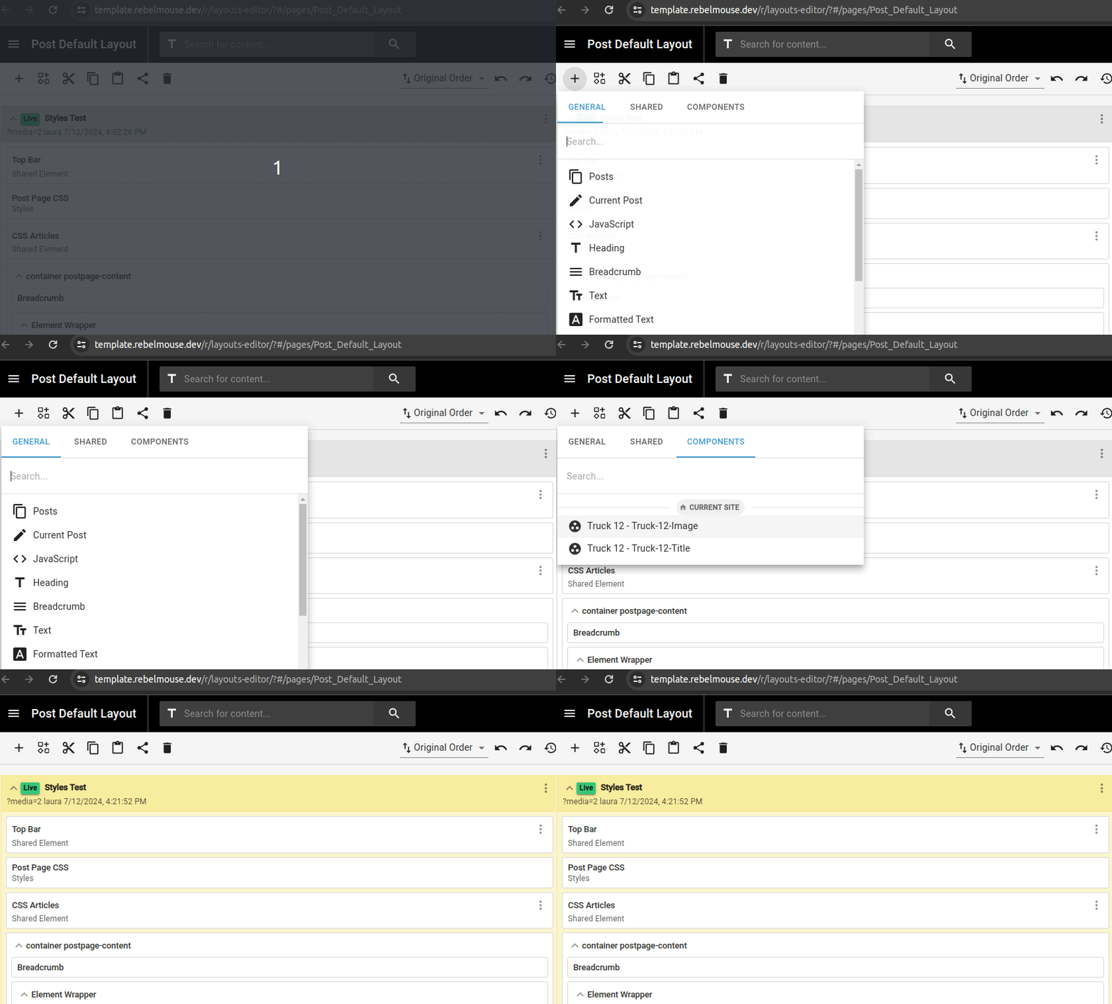
For using any Display Content element you need to:
Click on +, Display Content, and click on the display content element you want to add to the page.

The Display Content element will be then shared on the page.
Importing Display Content Elements from a different site
In order to allow the current site to pull Display Content Elements from a different site, you will just need to grant permission using Site Networks Tool. Great! Once this is done it means that your current site can use the Display Content Elements from a different site (and any other shared element).
Using Display Content Elements from a different site
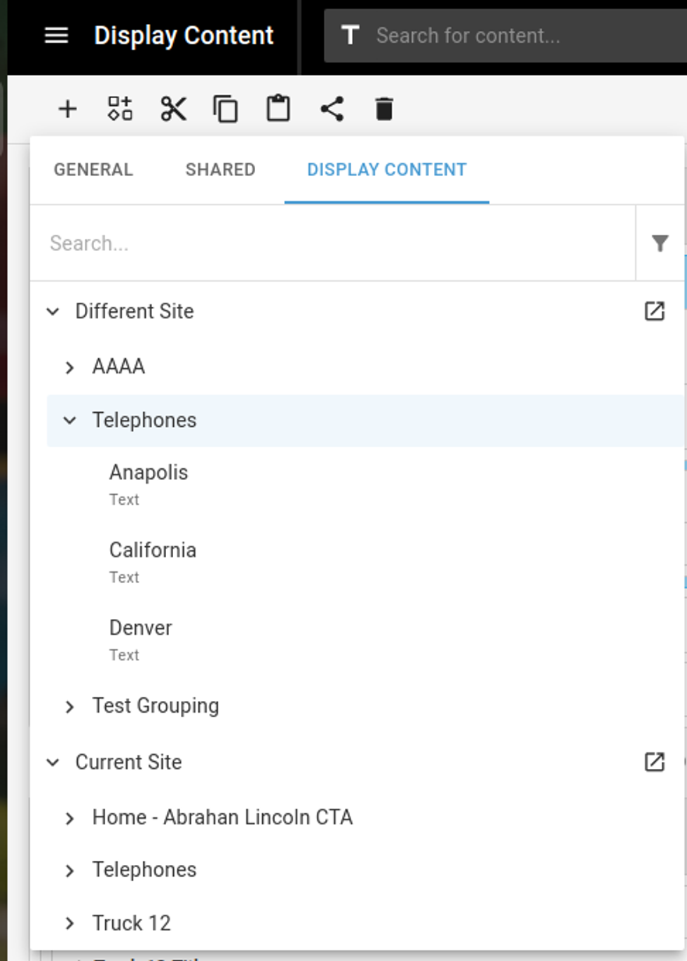
Once the permission is granted via Site Network you will see that any display content element existing on the original site will show up on the current site on the Display Content list. And you can just use it.
In summary, RebelMouse's Display Content tool is crucial for maintaining a consistent and efficient site design. By providing a single source of truth for display content, it allows both technical and non-technical users to manage and update elements like text, images, and logos effortlessly. The flexibility of creating and grouping Display Content elements ensures that content is organized and easily accessible, empowering non-technical users to make changes themselves. Whether you're defining new Display Content elements or importing them from another site, the Display Content tool simplifies content management and keeps your site cohesive and professional.
Table of Contents
- What is Display Content and Why It Matters?
- How to Enable Display Content for your site?
- How to access Display Content elements?
- This is how the dashboard looks like:
- Wrappers or Grouping
- Defining Display Content Elements
- Define Values for Display Content Types
- Using Display Content Elements
- Importing Display Content Elements from a different site
- Using Display Content Elements from a different site
© 2025 RebelMouse. All rights reserved.
Comments Moderation Tools