The modern content lifecycle looks different for every publisher. This is why we're constantly updating our editorial suite to cater to the needs of every team. Most CMS platforms have a one-size-fits-all approach to their Entry Editors, but this requires editorial teams to work around the confines of those systems. Instead, what if you had the power to fully customize your Entry Editor for your team and organization in a way that best suits your workflow?
Now, on RebelMouse, it's possible. We've extended our Layout & Design Tool to include the ability to customize your Entry Editor experience. Here's how it works.
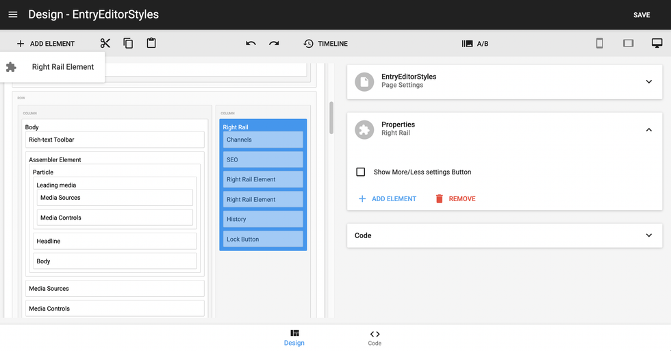
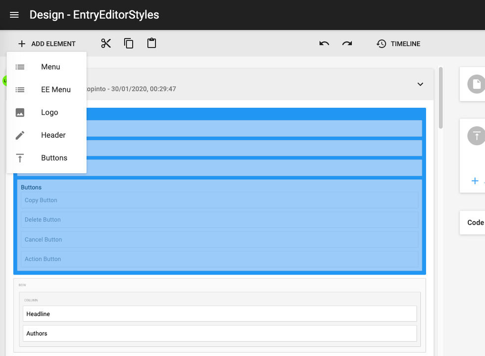
There are several elements in Layout & Design Tool that you can use to personalize your Entry Editor interface:
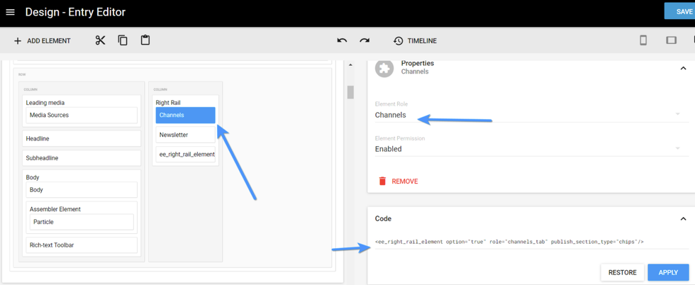
Right Rail Element: Use this element to choose which tabs you would like to see in Entry Editor's right-hand navigation rail:
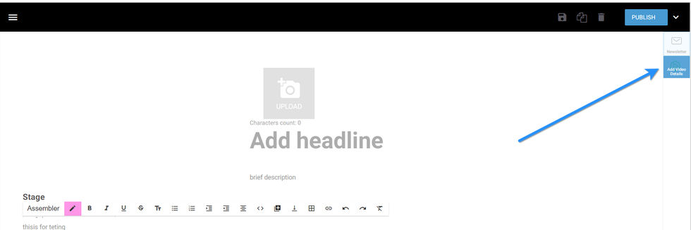
Custom Right Rail: In Layout & Design Tool, you can choose what's displayed in the right rail. You can add images and titles, as well as choose if the right rail is visible to editors only:
Here's an example of what a custom right rail looks like once enabled:
Once you have created your custom right rail, you can further customize the components inside of it. Here's a screencast of how it works:
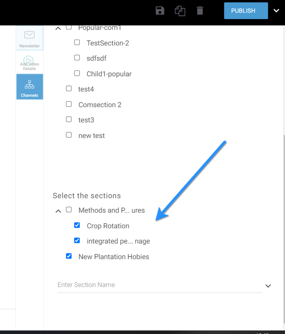
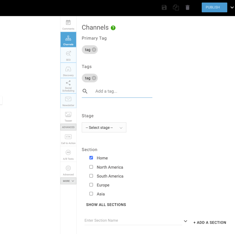
Channels Element: The Channels element allows you to customize how your sections are displayed in the right rail. There are several different design options.
You can set your sections to the Chips format, which resembles tags:
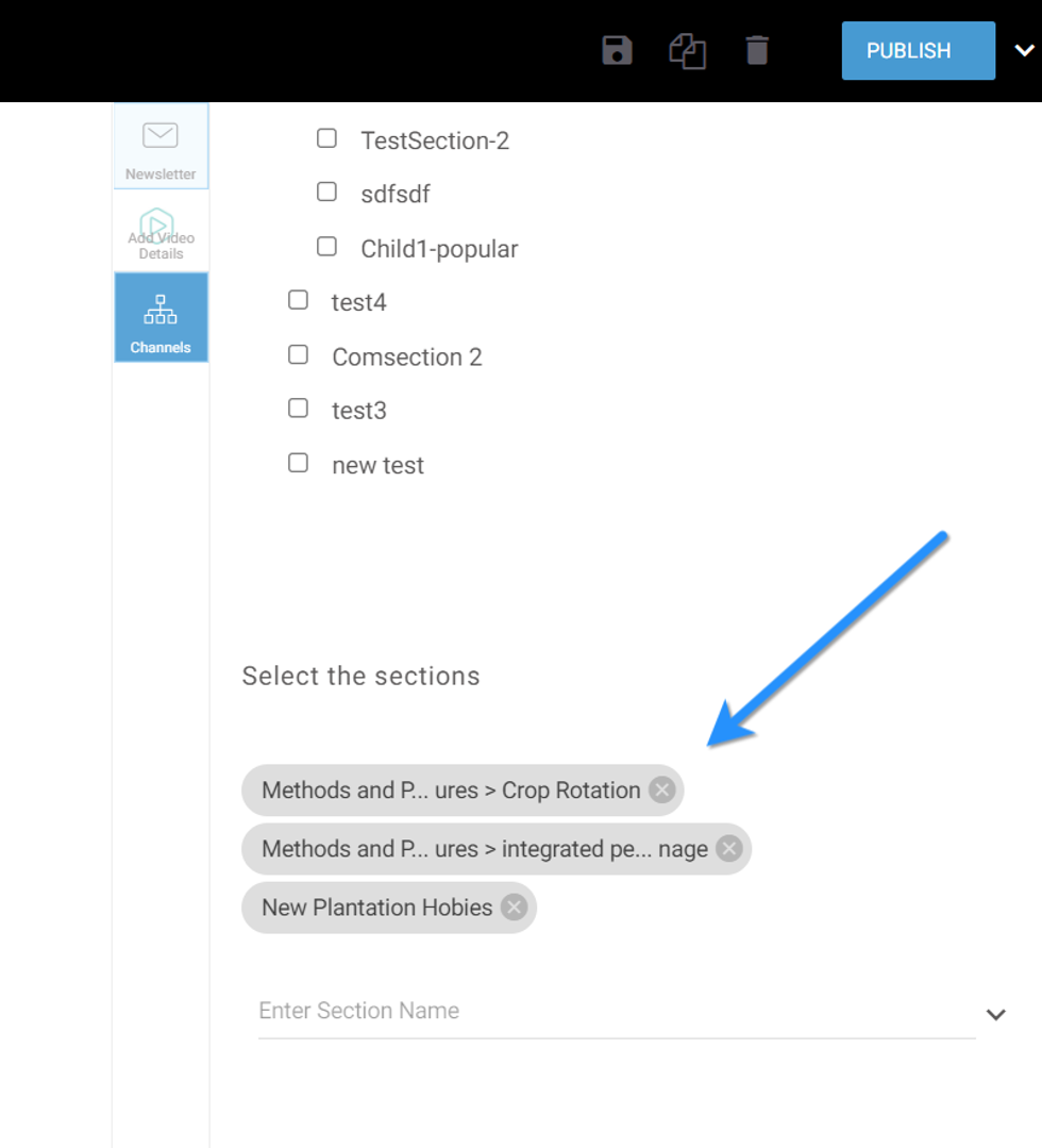
Sections can also be displayed in checkboxes:
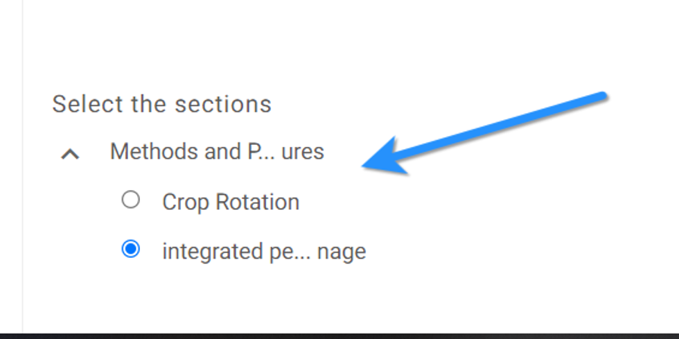
Sections can also be displayed as radio buttons for users without permissions to choose parent sections:
Here's how the setup of the Channels element looks in Layout & Design Tool:
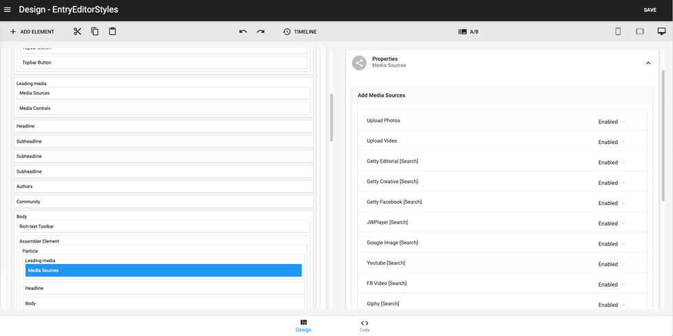
Body Element: This element allows you to choose what media controls your users have access to. In the following example, users can see the Add Media Bar, as well as the different media types they can add to a post:
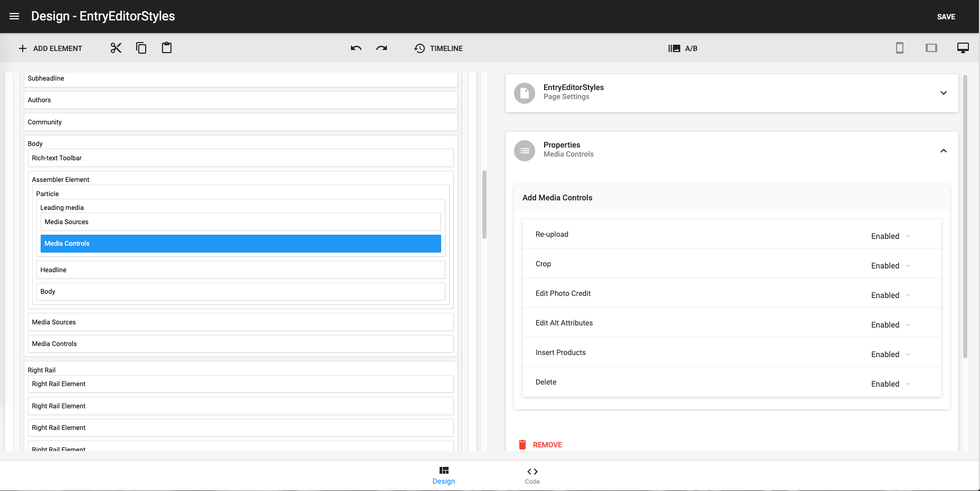
Additionally, you can choose which media types (or sources) they can add:
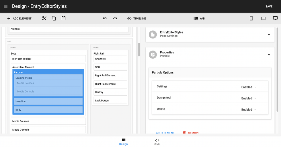
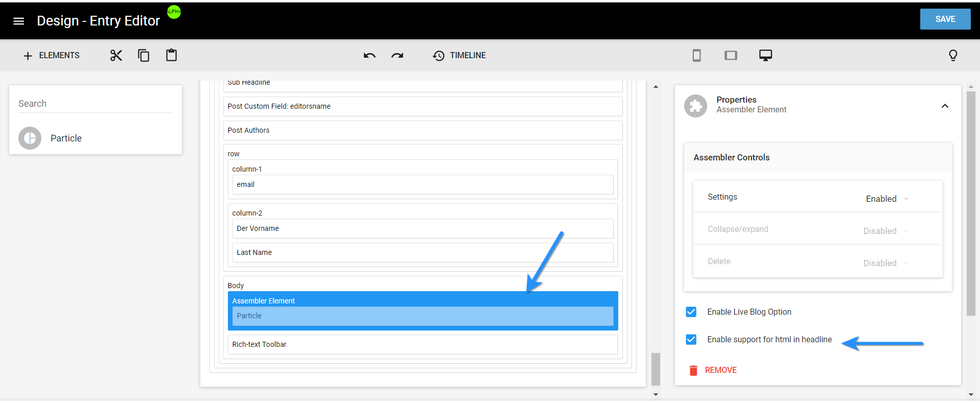
Assembler Element: You can use this element to decide if you would like users to be able to add or remove Assembler particles:
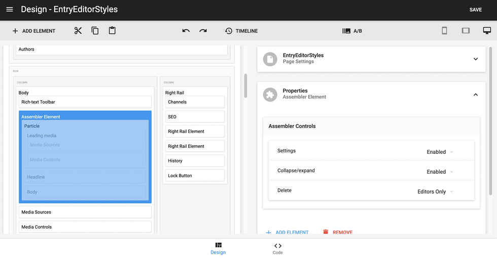
Additionally, you can control what types of media content can be embedded into particles:
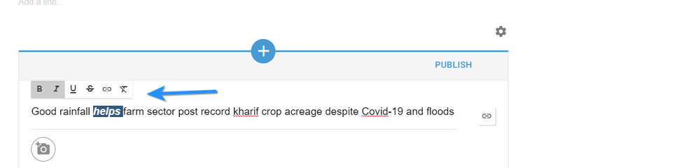
You can also use the Assembler element to enable HTML formatting for particle titles. To do this, tick the checkbox Enable Support for HTML in Headline.
Once selected, you should see a formatting toolbar appear in Entry Editor that allows you to adjust any part of a particle's title:
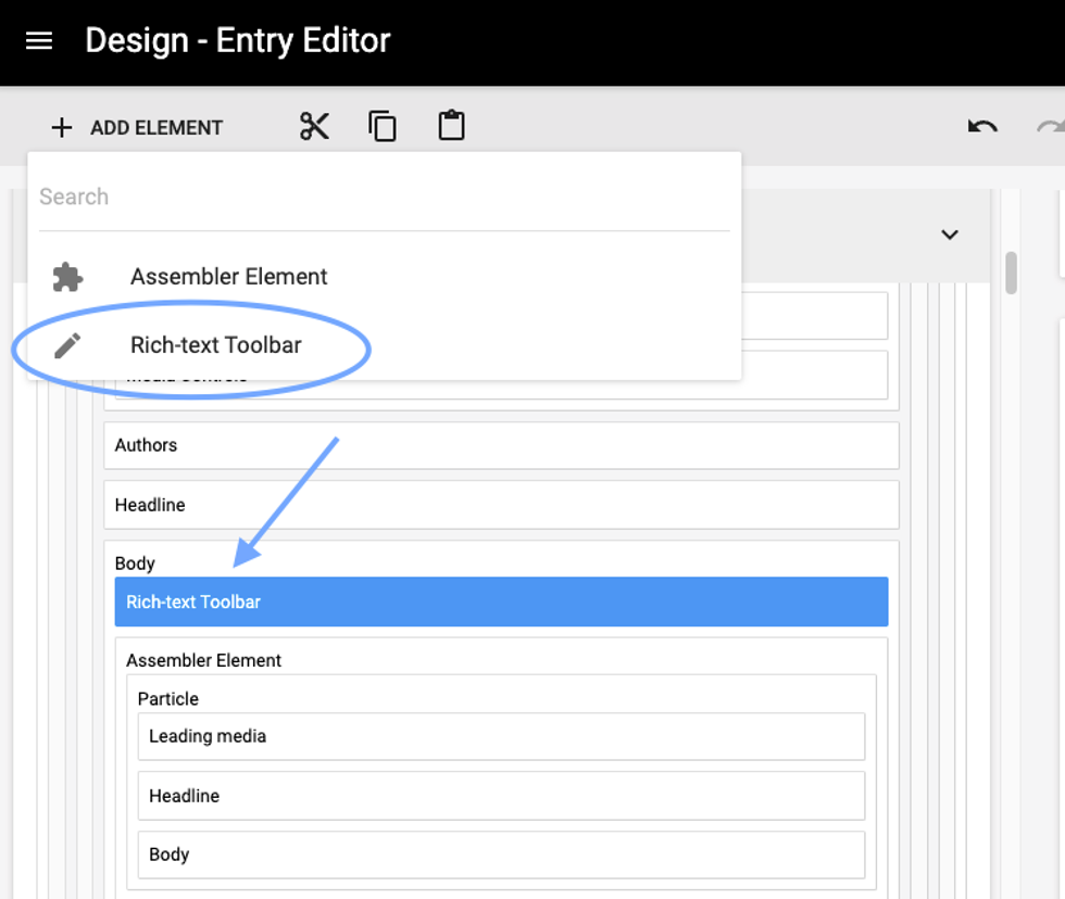
You can also add a formatting toolbar to the main body and particle body, and select exactly what options you want to show. Simply select the Rich-text Toolbar element in Layout & Design tool, and add it to either section you wish. Here you can see the Rich-text toolbar added to the main body element in Layout & Design tool:
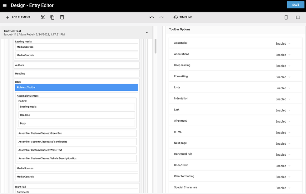
And here you can see the various options that you can either enable or disable as you determine appropriate:
Stages Element: You can use this element to add a Stages drop-down menu anywhere in Entry Editor:
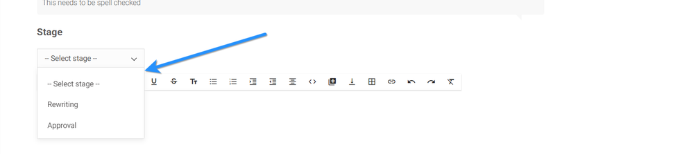
Here's how to enable the Stages element in Layout & Design Tool:
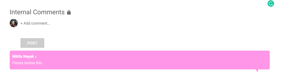
Private Comments: You can enable the Private Comments element in Layout & Design Tool to show internal team comments in Entry Editor.
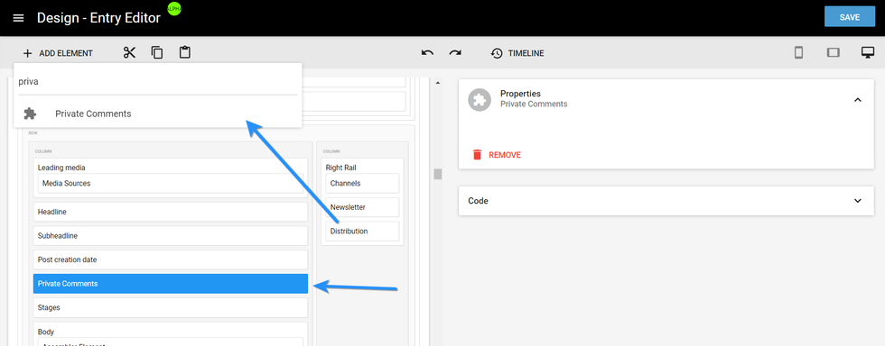
Here's what a private comment looks like in Entry Editor:
Post Creation Date: The Post Creation Date element allows you set the post's creation date anywhere in Entry Editor.
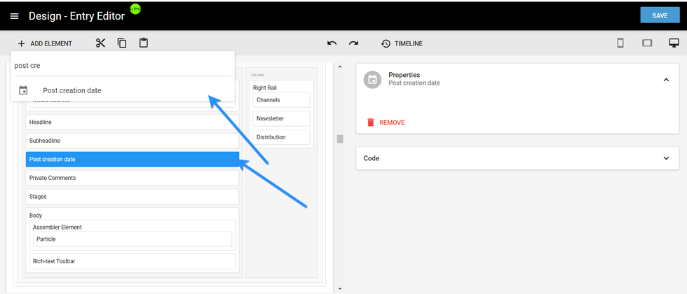
Here's what the Post Creation Date element looks like in Entry Editor:
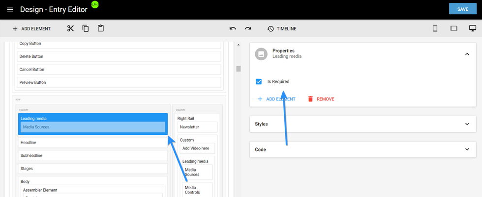
Required Lead Media: You can make sure that a lead media source is required for every article. This can be set in Layout & Design Tool by ticking the Is Required checkbox in the Properties card of the Leading Media element.
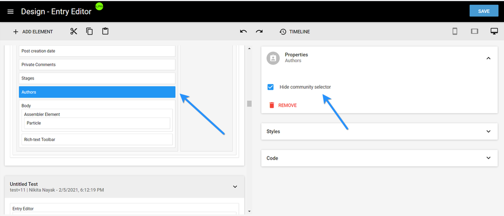
Hide Community Option: In the Properties card of the Authors element, you can tick the Hide Community Selector checkbox to hide the option to add a community in Entry Editor:
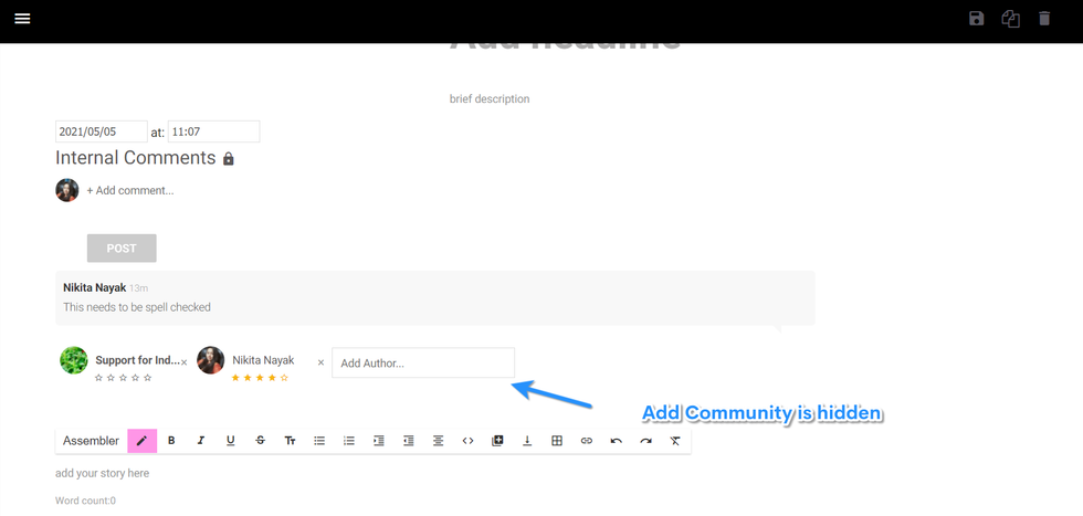
Once clicked, you will not see the option to add a community in the byline field of Entry Editor:
Turn Articles Into Particles: By adding the following line of code to an Entry Editor layout in Layout & Design Tool, you can easily turn previously published articles into new particles.
<ee_sidebar_search limit="11" is_body_allowed="true"/>
Once this code is added, you will have the ability to search for articles within Entry Editor. From there, you can drag and drop those articles into new particles. Here's a screencast of how this works:
This feature will pull the entire body of the post into a new particle. It can be handy tool if you plan to turn a post into a newsletter. Read more about this feature here.
You can also use the search bar to drag and drop different Assembler particles into a new article. These particles can come from any post published on your site. This will only pull the first particle from the original article, and not the entire content of the Assembler.
Here's a screencast of the workflow:
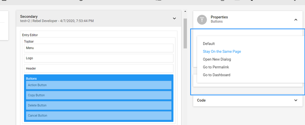
Top Bar: This element allows you to control what fields, tabs, and media options are displayed, including the action buttons users have access to:
Action Buttons: These buttons allow you to customize your users' experience after they publish an article. There are five different options:
- Default: This will publish the article and redirect the user to the live article page.
- Stay on the Same Page: This allows the user to publish or update an article and remain in Entry Editor instead of getting redirected to the live article page. This is helpful for writers and editors that need to continuously update a particular post.
- Open New Dialog: This will redirect the user to create a new article.
- Go to Permalink: This will redirect the user to a link you've specified.
- Go to Dashboard: This will redirect the user to your Post Dashboard.
Default Preview Device: You can set a default preview device for your articles. To do so, add a line of code in the ee_topbar_button option under the Buttons menu in Layout & Design Tool. Here's a list of code options by device:
Desktop:
<ee_topbar_button option="true" role="preview_button" preview_default_device="device-desktop"/>
iPhone 5:
<ee_topbar_button option="true" role="preview_button" preview_default_device="device-iphone5"/>
iPhone 6:
<ee_topbar_button option="true" role="preview_button" preview_default_device="device-iphone6"/>
iPad:
<ee_topbar_button option="true" role="preview_button" preview_default_device="device-ipad"/>
Samsung Galaxy:
<ee_topbar_button option="true" role="preview_button" preview_default_device="device-galaxy"/>
Once the code is added, it will redirect the user to that specific device when the article is previewed in Entry Editor. Here's a screencast of the workflow:
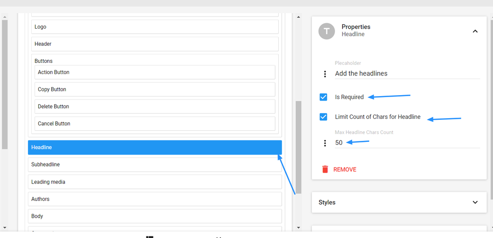
Text Validation Rules: This allows you to customize limits on words, characters, and lines in your articles. You can set the parameters for these rules using the Properties card of an associated element.
For example, here's how you would set the character count for the headlines of your articles:
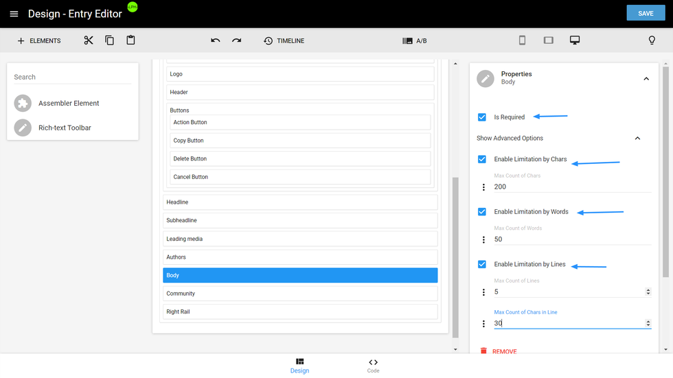
Here's a screenshot that shows how to set the character, word, and line counts for the body of your articles:
And here's what the text validation warning can look like in Entry Editor when all set rules aren't met:
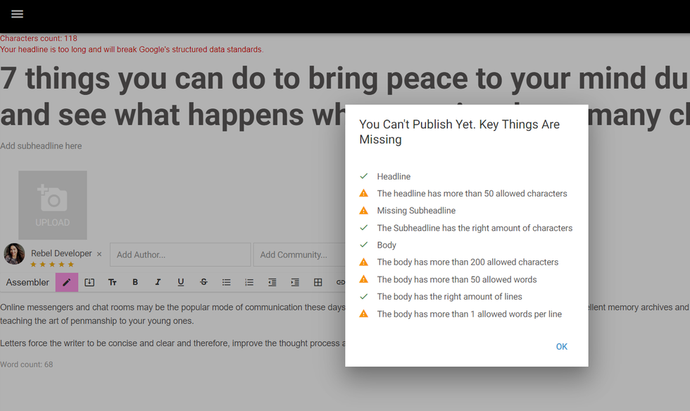
These Entry Editor warnings aren't just suggestions, either. They prevent your writers from publishing articles that don't satisfy the conditions you've preset to help ensure that your content meets your editorial guidelines.
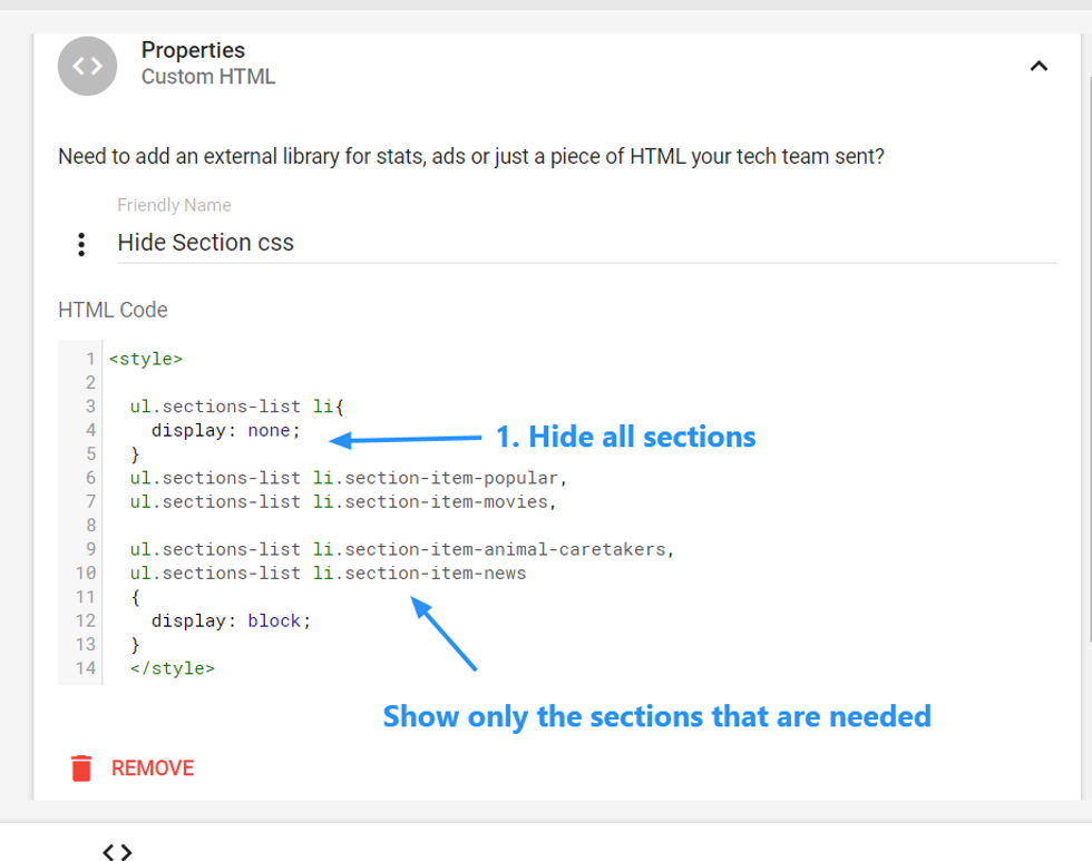
Hide Sections: You can choose to only display sections that are relevant to a specific post type in Entry Editor. For example, if you're writing a recipe, you may not want to see any sections that are related to animals.
To make this functionality possible, we've implemented classes for all sections:
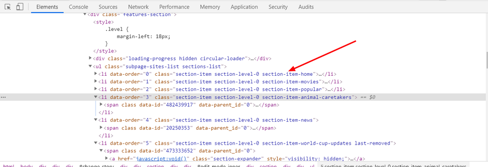
You can hide or show sections using simple CSS. This is done using a Custom HTML element in Layout & Design Tool:
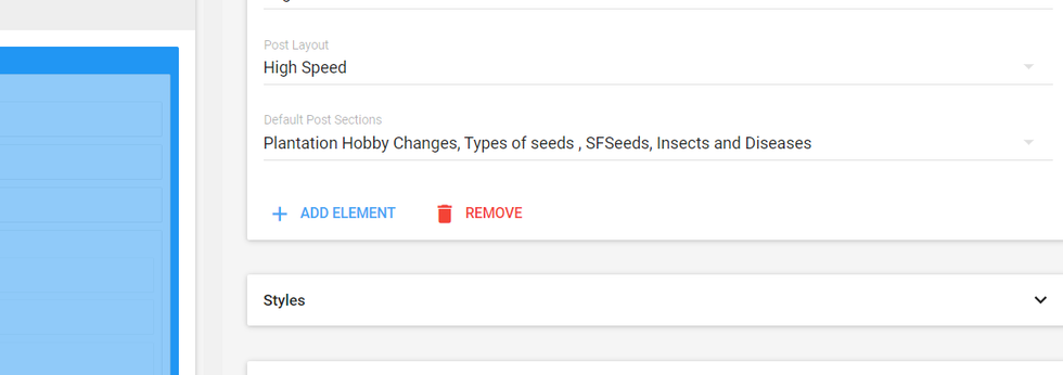
Assign Default Sections
In Layout & Design Tool, you can predetermine which sections will be assigned to an article through a custom Entry Editor layout:
Here's a screencast of the workflow:
Here's a screencast that shows how some of the above elements function:
Additionally, you can now choose between a default view of sections and a more custom view that matches how we show tags on the sidebar. This is a view of the default view of sections:
And here's how it can look with the tag view:
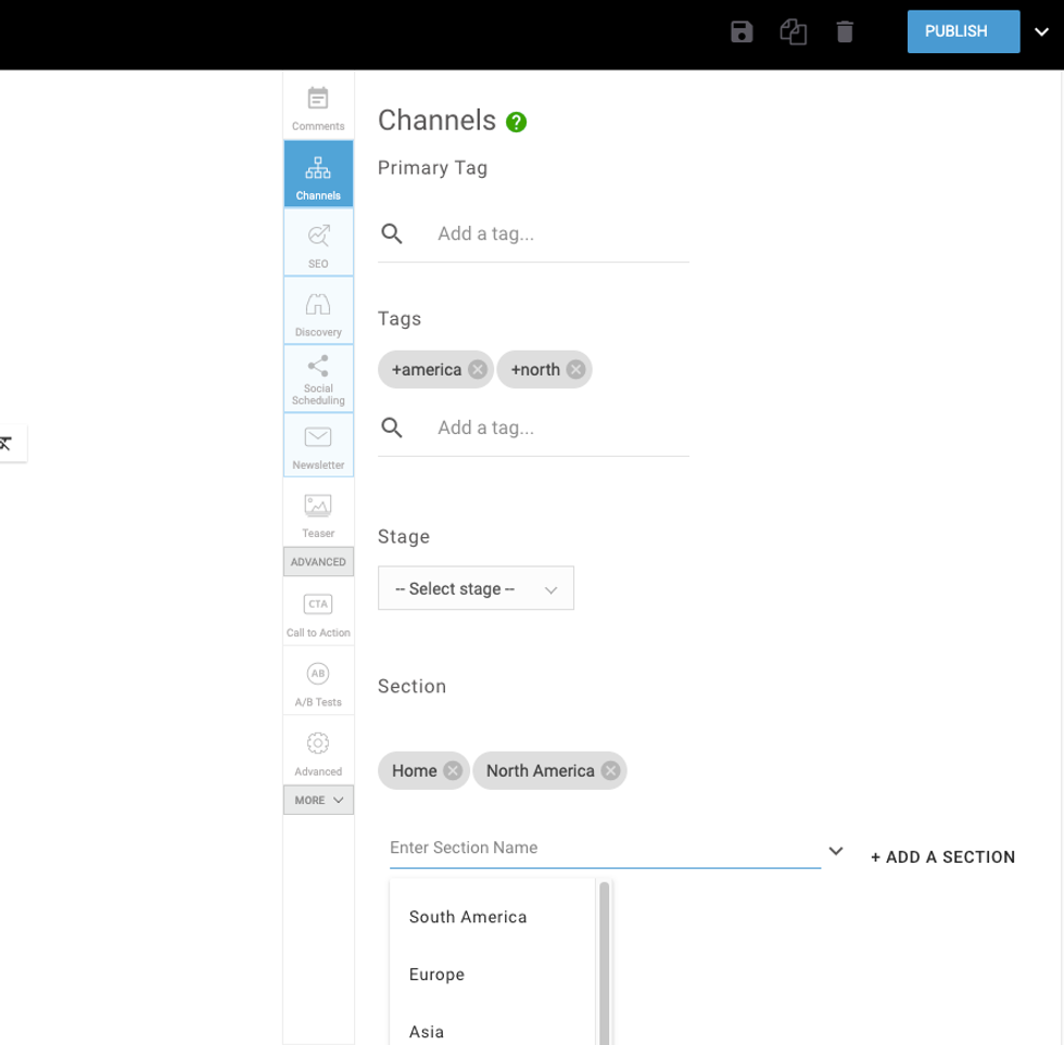
To achieve the tag style section list, you simply need to add the following code to the channels element in Layout & Design Tool:
publish_section_type="chips"
Here's how that looks in Layout & Design Tool:
We also allow you to choose which Post Page layout should display for a specific customized Entry Editor by giving you the option to select from A/B-test Post Page layouts that you've previously set up. This means your users can publish different types of articles with corresponding layouts depending on what version of Entry Editor they're using. Here's what the setup looks like in Layout & Design Tool:
And here's a screencast of how it works:
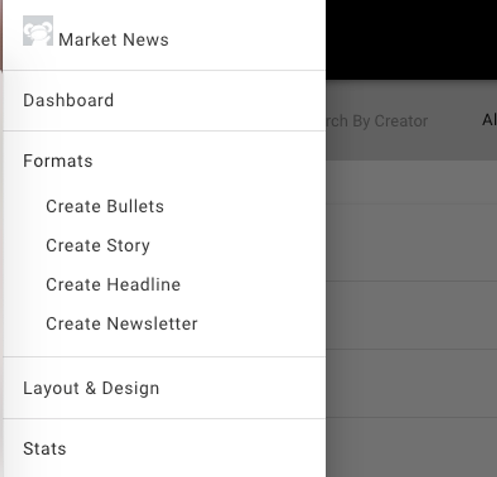
These new options will show up in the hamburger menu (☰) of your Dashboard. Up until now, these modifications needed to be implemented by our Client Services team upon request. But with this latest update, you're empowered to take control of your users' editorial experience.
Customize the Right Rail View in Entry Editor
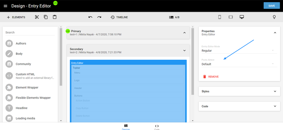
In Layout & Design Tool, you can customize how the blue navigation menu, or Right Rail, appears in Entry Editor. You can choose your view via the Properties card of the Right Rail element.
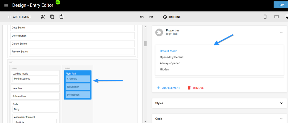
From there, you will see a drop-down menu with four different options:
- Default Mode: The Right Rail opens anytime a user clicks on it, and clicking anywhere outside of the menu will close it automatically.
- Opened by Default: The Right Rail will be open by default.
- Always Opened: The Right Rail will not close.
- Hidden: All tabs in the Right Rail will be hidden.
Examples of Custom Entry Editor Views
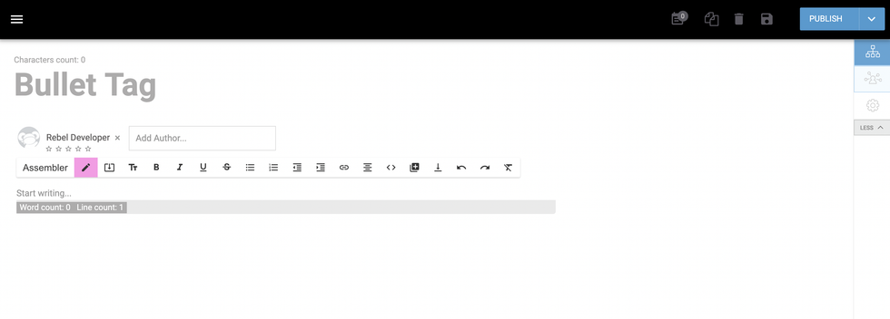
Headline Only: For one of our clients, we customized their Entry Editor to only show the headline of a post so that their content team can focus on populating it with keywords and a code. Here's a screenshot of their simplified right-hand rail:
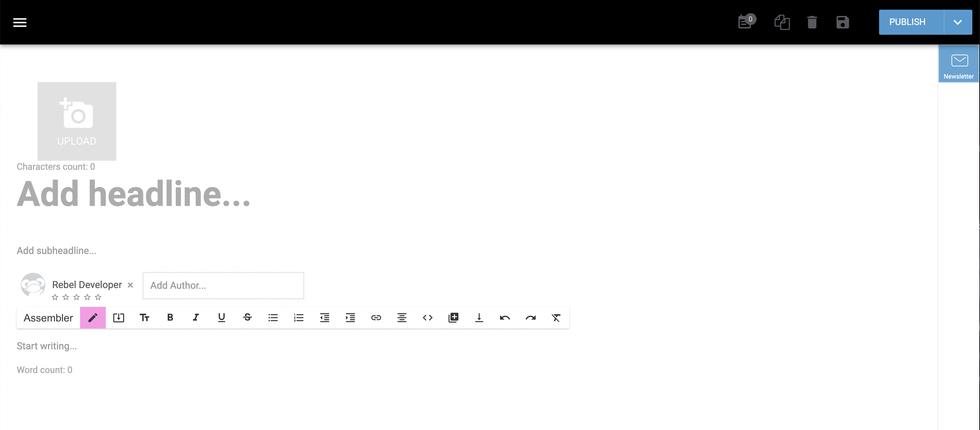
Here's another example of an Entry Editor that's used solely for sending out newsletters:
Additional Customization Possibilities
Looking to do even more? If you'd like to be able to customize Entry Editor so that instead of having different layouts for different types of posts (e.g., recipes, newsletters, etc.), you can create user and/or community-based layouts, you're in luck! Using custom code, we can recognize what user permissions (or roles) a writer or editor has, and automatically render the appropriate Entry Editor layout for the permissions that user has. Likewise, we can also identify the community that a user belongs to, and again automatically render the appropriate Entry Editor layout.
This level of customization currently requires our team to work alongside you on the proper configuration. If you're interested in having this implemented, please contact us and we'll scope out your needs.
If you have any questions about customizing your Entry Editor experience, email support@rebelmouse.com or talk to your account manager today. Happy customizing!


