

The team at RebelMouse that works on user interface (UI) design often faces challenges that can make or break a user's experience (UX). The following list breaks down some of the typical issues that we might run into, from how things look to how easy they are to use.
General Design
Inconsistent Design Elements
Mismatched design elements, such as different button styles, varying fonts, or inconsistent color schemes, can lead to a confusing and disjointed user experience.
Example:
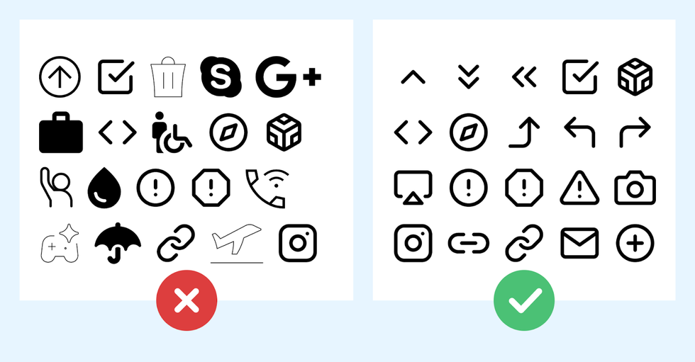
Inconsistent Iconography
Using icons that are stylistically different or have varying meanings can confuse users.
Example: An interface uses different icon styles, leading to a lack of visual cohesion.
Inconsistent or Non-Intuitive Symbol Use
Using symbols or icons that are not universally recognized or intuitive can lead to confusion.
“There are a few icons that enjoy mostly universal recognition from users. The icons for home, print, and the magnifying glass for search are such instances. Outside of these examples, most icons continue to be ambiguous to users due to their association with different meanings across various interfaces. To help overcome the ambiguity that almost all icons face, a text label must be present alongside an icon to clarify its meaning in that particular context.”
—From the Nielsen Norman Group on Icon Usability
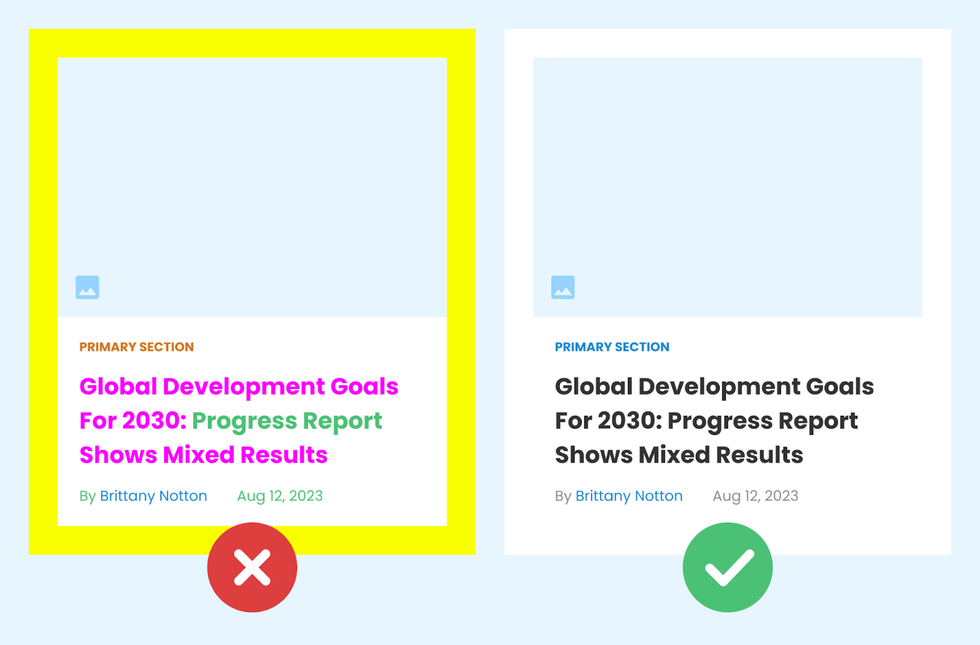
Overuse of Colors or Fonts
Using too many colors or font types can make a design look cluttered, and can detract from the overall user experience. It’s essential to maintain a balance.
Example:
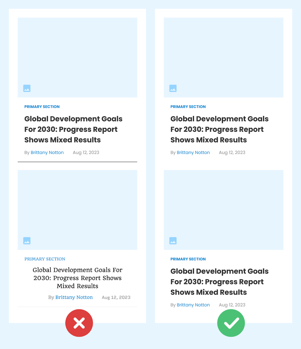
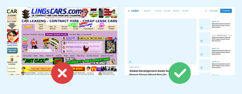
Cluttered Layout
Overcrowding a page with too many elements can overwhelm users, making it difficult to focus on the most important content.
Example:
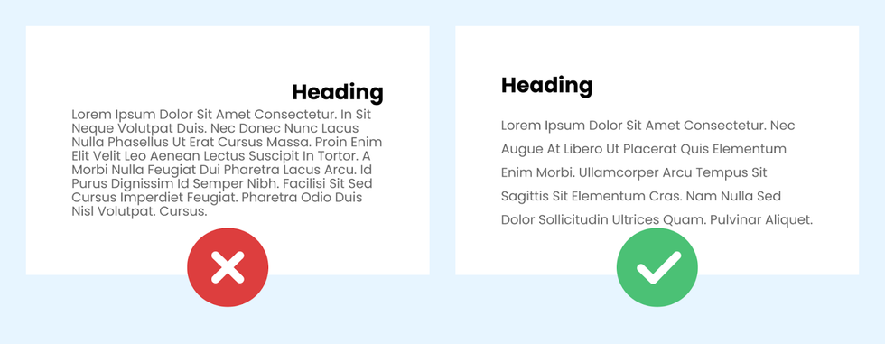
Poor Alignment and Spacing
Inconsistent alignment and improper spacing can disrupt the visual harmony and hierarchy of the interface.
Example:
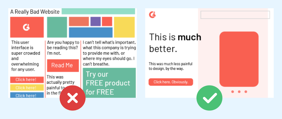
Lack of a Clear Hierarchy in Information
Without a clear visual hierarchy, users may struggle to understand which elements are the most important.
Example:
Lack of Consistent Branding
Inconsistent branding across different pages or platforms can confuse users about your identity and professionalism.
Example: A company’s branding has a completely different color scheme and logo compared to its website.
Navigation and Accessibility
Poor Navigation
Complicated or unclear navigation can frustrate users, making it difficult for them to find what they are looking for.
Example: A complex website with no search function or clear menu, making it hard to find specific sections.
Inadequate Error Handling
Not providing clear and helpful error messages can leave users confused and frustrated when things go wrong.
Example: An online form that returns a generic "Error Occurred" message without specifying what the user needs to fix.
Poorly Designed Search Functionality
A search feature that returns irrelevant results or is hard to use can significantly hinder the user experience.
Example: A news website's search function that returns unrelated news, frustrating users.
Technical Aspects
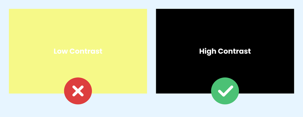
Low Contrast
Insufficient contrast, especially with text, can make content hard to read, impacting accessibility and usability.
Example:
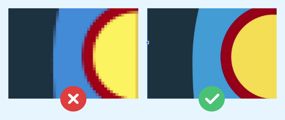
Ignoring the Use of Scalable Vector Graphics (SVGs)
Not using SVGs for icons and other graphics can result in poor rendering on high-resolution displays.
Example:
Design Beautiful Websites With RebelMouse
To summarize, the trick to effective user interface design lies in your ability to present a seamless and intuitive experience. Finding the right balance across design elements and functionality sets the stage for interfaces that users find both aesthetically pleasing and easy to navigate. A detailed, user-centric approach in addressing these design challenges can significantly elevate the overall user experience.
If you would like to learn more about creating attention-grabbing user interfaces for your digital properties, let’s connect.


