

The Fulcrum continues to grow, thanks to a redesign of their website that improves technical SEO and an editorial focus on establishing itself as an authority on a key trending topic in U.S. politics.
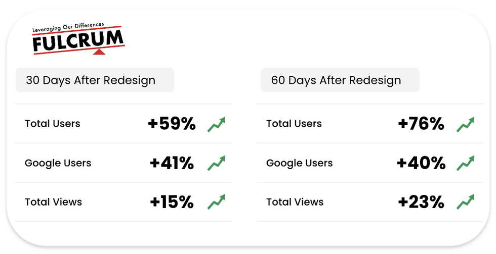
Just a few months after we shared how this publisher is following a digital media playbook for growth, we collaborated with their team to launch a redesign on July 1, 2024 and made a concerted effort on a “Project 2025” content series. In the four weeks since, they’ve seen remarkable growth, including a 46% increase in Google Search clicks, and 120% increase in Google News clicks.
The redesign emphasized speed and performance, and no doubt helped with SEO so that their Project 2025 work could reach a larger audience. It is based on our new Publisher Blueprints, born out of thousands of hours of research, development, and best practices, and fully optimized for fast performance and the best user experience possible. They also incorporate design recommendations from the Google News Initiative.
The Fulcrum has also seen more Google Discover traffic since the redesign than the previous four months combined! It’s an incredibly encouraging trajectory, especially with the 2024 U.S. Election on the horizon, which The Fulcrum will be covering closely.
While the redesign helped position The Fulcrum for SEO wins, the publisher has done an excellent job articulating a major issue of the election season: Project 2025. They’re approaching the coverage in an all-hands-on-deck, non-partisan way. We worked together with the publisher, identifying this as a huge opportunity after the SEO success of their initial piece, “Project 2025 is a threat to democracy.” The Fulcrum's co-publishers David L. Nevins and Kristina Becvar turned that feedback into an informative series, and they’re constantly adding fresh content.
As the publisher states on individual articles, they are exploring the issue with a lens that “relies on unbiased critical thinking, reexamines outdated assumptions, and uses reason, scientific evidence, and data in analyzing and critiquing Project 2025.” It's a unique approach with comprehensive analysis.
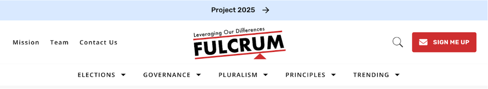
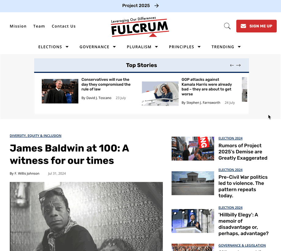
All of the Project 2025 content comes together with a can’t-miss “Project 2025” banner at the top of the site that lands users on the latest stories. This appears across their site.
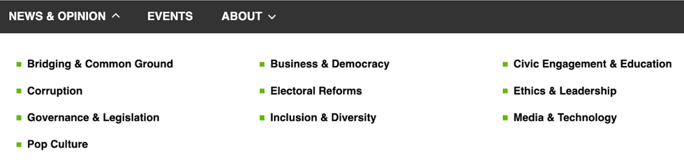
Revamped Taxonomy
BEFORE:
AFTER:
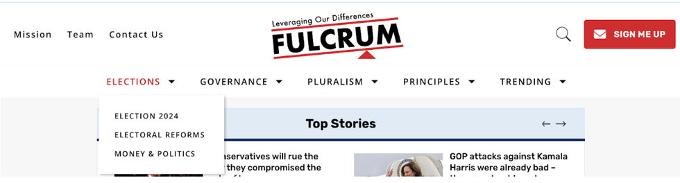
Let’s dive into some nuances of the redesign. Previously, nearly everything was lumped together under a “News & Opinion” menu. Now, as a part of the redesign, there is a clear and logical taxonomy broken into five buckets that vastly improves the user experience and the crawling process for SEO. It emphasizes the topics that The Fulcrum most frequently covers and organizes it all in a dynamic way that can be updated based on current events.
For example, it is a presidential election year in the United States and that is at the forefront of a lot of what The Fulcrum is writing about, so “Elections” are given prime importance in their navigation bar with breakouts into Election 2024, Electoral Reforms, and Money & Politics. Other content is rolled into the categories of Governance, Pluralism, Principles, and Trending. The “Trending” category in particular is a fun one as it includes Artificial Intelligence and Pop Culture.
Perfect Core Web Vitals
The user experience was vastly improved with The Fulcrum’s redesign, the site is super fast and responsive, as we used the following tactics to optimize for Core Web Vitals:
- Ultra-light JavaScript application; cleaned and optimized CSS and HTML
- Smart caching rules
- GZIP compression, which reduces file sizes by up to 85%
- A progressive web app (PWA) and a smart page load strategy
- Blueprints preload fonts and load images ahead of time for certain screen sizes depending on network speeds
- Ads and other key resources load right after the critical elements
More Appealing Section Pages
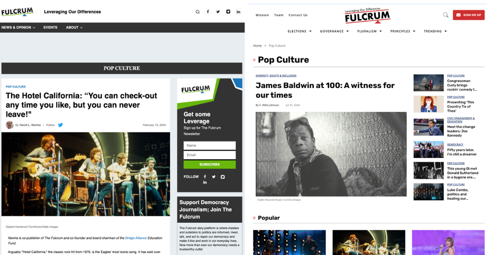
Sections like Pop Culture have a wonderful new look. Instead of putting so much prominence on a single article and nothing else, like the old design, a lead story is in the spotlight, while other recently written articles have quick headlines and images along the side. Popular stories in the section are just a slight scroll down — look, there’s Taylor Swift. This is much more appealing for user experience, as it’s easier to browse more content and make a choice on what you’d like to learn more about.
Enhanced Author Pages
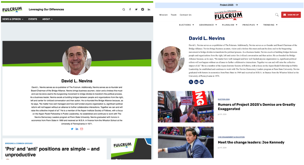
The beautiful new author pages are much more pleasing to the eye, going beyond the bio with new-look icons unified in design and calling attention to more stories with headlines and images. It’s also easier to get to other sections of the site with the improved navigation bar, and the newsletter call-out at the top right helps to increase subscriptions.
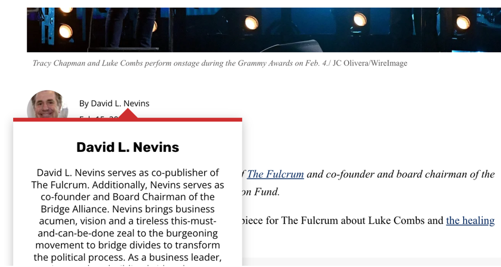
Plus, on article pages, you can now hover over an author name for more details about them:
Home Page Based on Categories
Before the redesign, the home page was an endless scroll of articles. The redesign introduced strips of content based on categories, allowing users to quickly consume many more headlines and images across content categories and make an informed choice on what they would like to learn more about.
Mobile-First Design
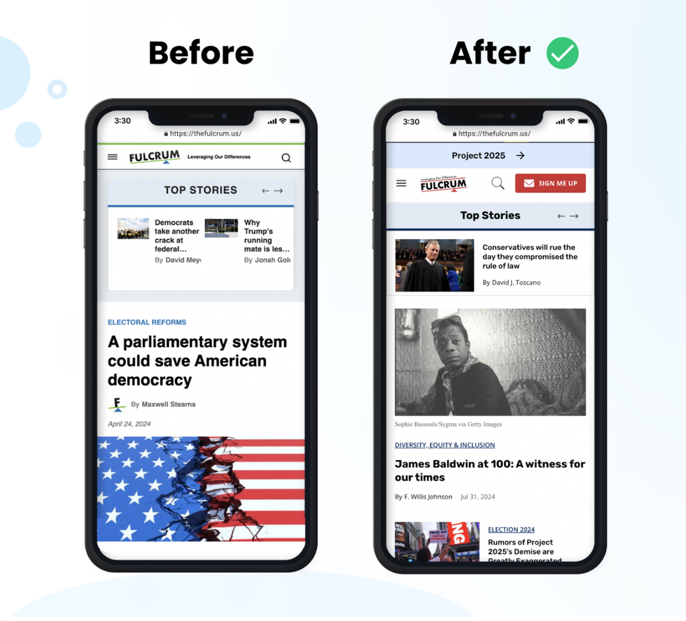
The new design puts a focus on mobile with more content available on the page, clear calls to action (such as a “Sign Me Up” red button promoting the newsletter), and beautiful images.
Would you like to see how our new Blueprints could supercharge your own website? Reach out today to get started!


