
It all started with a vision, a wild vision.
What if...our CTA button...was a little bit bluer?
I took the idea straight up the ladder. The Marketing Manager loved it. The VP of Strategy called it “visionary.” And when I finally pitched it to the exalted Grand Elder Statesman of Web Design, he simply whispered, “At last.”
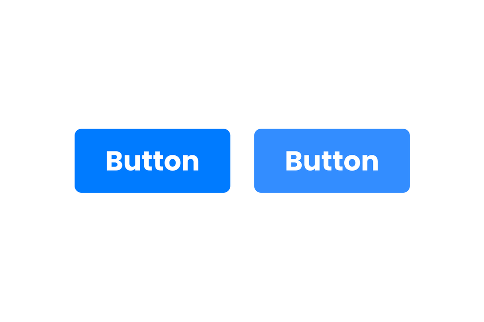
We workshopped for several weeks, before deciding to test between a nice #007BFF and a bold #338DFF. Just look at the concept art below to understand how radical this idea was:
We ran a baseline test with a sample size of almost a dozen, and after a test of just over eight hours, the results were in.
Conversions increased by .03%.
Success.
After that, we were unstoppable.
We wrote a 10-part blog series and produced a YouTube documentary (nine views and counting).
Truly, our moment had arrived.
After the tour, we went to Finance to collect our spoils.
“How much is revenue up?”
“Um, we’re down 29% quarter over quarter.”
“Oh. Shit.”
Everything we had done, everything we had been through, meant nothing. Less than nothing even. We had dreamed big, bigger than we ever dreamed we could, and we failed.
Morale was at an all-time low.
Days passed by, and then, a timid knock on my door. It was the intern, fresh out of college and still totally wet behind the ears.
“Sir, I love the button, but it doesn’t lead anywhere.”
“What do you mean? It’s a button.”
“Yeah, but that’s it. It doesn’t lead to a form, or more content, or anything. And the page takes two minutes to load. Also, the site freezes completely if you scroll too fast.”
That’s when we realized, the button was never the problem.
The intern went to work and fixed everything. She cleaned the CSS. Fixed our Core Web Vitals. Deferred JavaScript. She even deleted the button to see if anyone would notice. (No one did.)
Six months later, we ran another test. We’d increased conversions by 3x.
Editor’s Note:
While this story is fictional, the point is all too real.
Too many teams obsess over small wins while ignoring the real problems and issues that bring true change: performance, user experience, and content that connects.
At RebelMouse, we help brands look beyond their buttons.
Our strategy team loves to help websites maximize their performance and value. Book a call with one of our experts today.


