

Introduction
Welcome to RebelMouse! We appreciate your collaboration as an external design team, and we want to ensure that we have a clear and consistent approach to design across all of our projects. To facilitate this, we've outlined the following design requirements and guidelines that we expect you to follow when working on RebelMouse projects.
Design Tool: Figma
At RebelMouse, we primarily use Figma as our design tool. Please make sure that you are comfortable with using Figma for our design projects. This is essential for efficient collaboration and version control.
Layout Dimensions
- Desktop
- All desktop layouts should have a width of 1440 pixels.
- Mobile
- All mobile layouts should have a width of 375 pixels.
- Tablet
- All tablet layouts should have a width of 1024 pixels and 768px. (It depends on the complexity of the layout.)
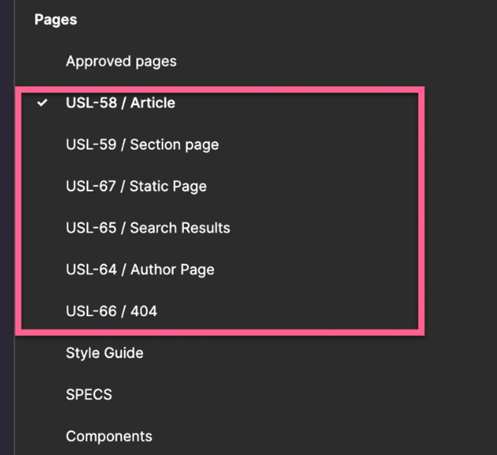
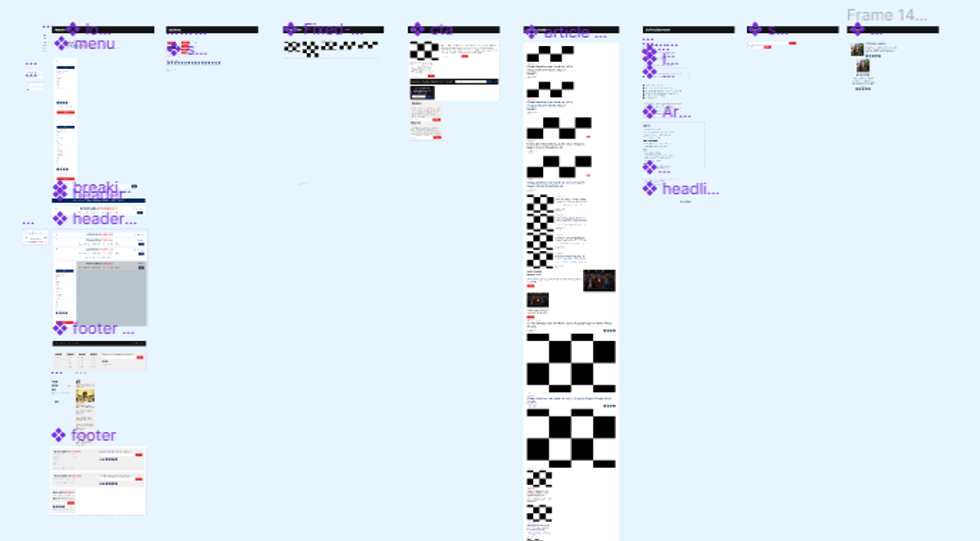
Design File Structure
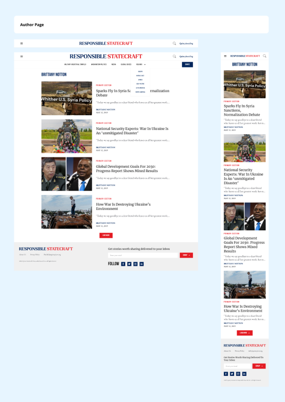
All approved layouts for a website project should be presented on the same page. This includes desktop, mobile, and tablet layouts.
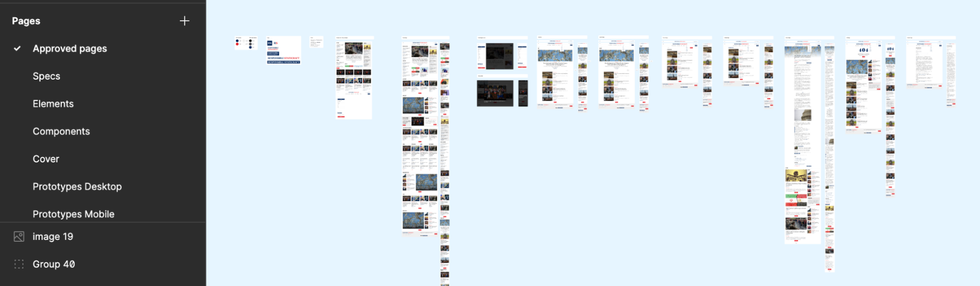
Pages and layouts that are currently under review, or are undergoing adjustments, should be segregated and organized separately to prevent any potential confusion.
Desktop and mobile layouts should be nested within a wrap, or next to each other with a label for organizational purposes.
Custom Features and User Flows
When incorporating a custom feature into a design, it’s essential to introduce it through a well-defined user flow, meticulously explaining each step in the process. User flows can be added to the clickable prototype.
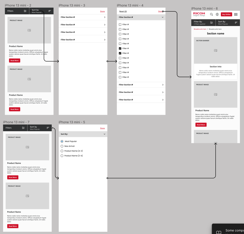
Image Aspect Ratios
All images used in our designs should follow specific aspect ratios: 3 x 4, 1 x 1, 3 x 2, 16 x 9, 2 x 1, and 3 x 1. Please ensure that images adhere to those ratios to maintain a consistent visual aesthetic.

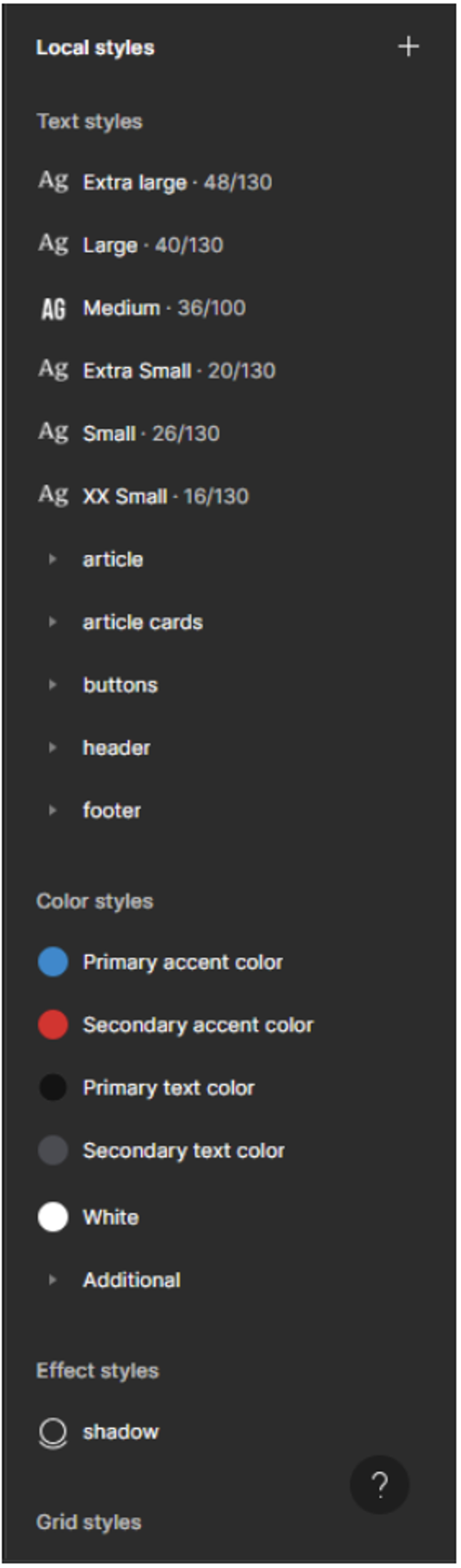
Style Guide
We provide a style guide that includes colors and typography (e.g., fonts, sizes, line height, etc.). It's essential to follow this guide for consistency.
The style guide should be presented as local styles in the Figma. This ensures that all team members have access to the latest design elements and can easily apply them.
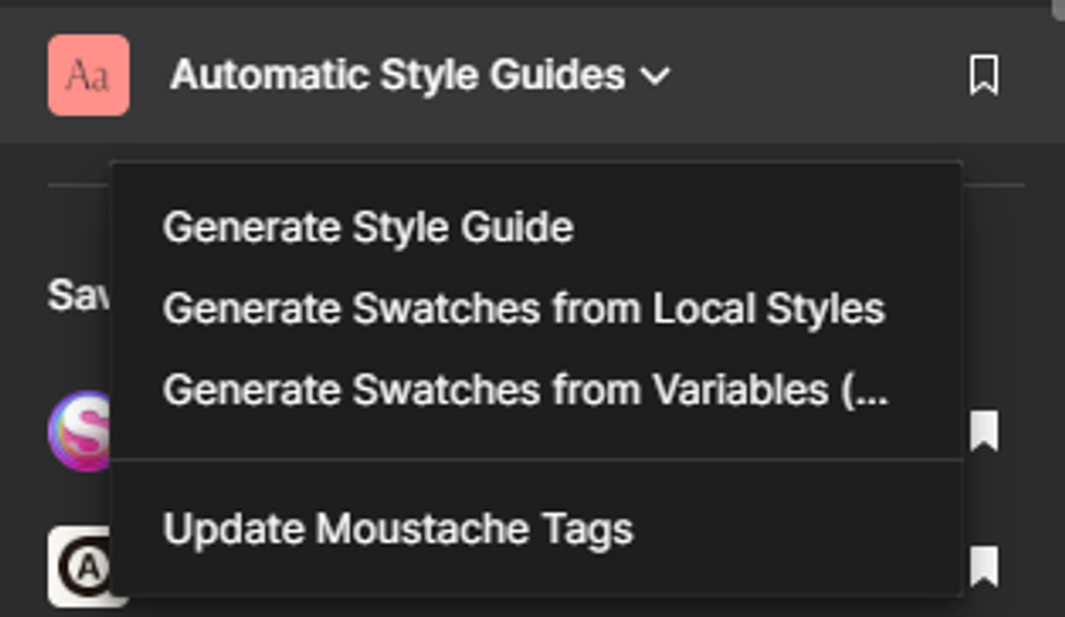
Exporting it as a presentation guide is important. To do this, we recommend using the "Automatic Style Guides" plugin, and specifically the "Generate Style Guide" option. This feature will generate a new page that visually presents all of the local styles, making it easier for developers to work with and reference them during the project.
Font Variables
RebelMouse's Blueprints require you to establish the following text variables:
Navigation
- Header ~> Section Link
- Header ~> Subsection Link
- Breadcrumbs
- Footer ~> Section Link
Headlines
- Extra Large
- Large
- Medium Large
- Medium
- Small
- Extra Small
Article Cards
- Primary Tag or Section
- Author Name
- Date
- Caption/Credit
- Paragraph Normal
- Paragraph Small
- Quote/Pull Quote
- Particle Headline
Forms
- Buttons
- Large
- Medium
- Small
- Extra Small
- Labels
- Medium
- Small
Color Palette and Variables
In RebelMouse’s Blueprints template, we use the following palette variables for colors:
Primary Accent Color
The primary accent color is used for key CTAs and clickable elements.
Secondary Accent Color
Usually a 20–30% transparent version of the primary accent color.
Primary Text Color
High contrast dark color that’s used for headlines.
Secondary Text Color
This color should be slightly lighter when compared to the primary text color. ( Example)
Tertiary Text Color
This color is used for supporting or less important text elements on a web page.It’s used across captions, credits, and other non-primary content.
Grid System
We use an eight-point grid system for designs. Please adhere to this grid system for layouts and spacing.
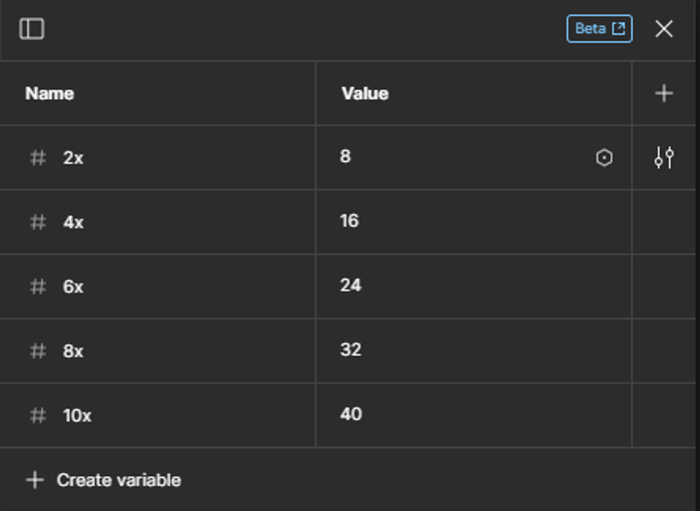
Measurements, such as margins and paddings, should be applied in local variables using the eight-point grid system. Common values include 8px, 16px, 24px, 32px, 40px, and so on.
Components
We encourage the use of components for all design elements whenever possible. Components enhance consistency and efficiency in design, and should be organized and named logically to facilitate easy reuse across different projects.
Specs
Within our design system, a "spec" primarily refers to spacing measurements, offering detailed guidelines for the distances between elements. It’s a guide that helps designers and developers stay consistent in their work.
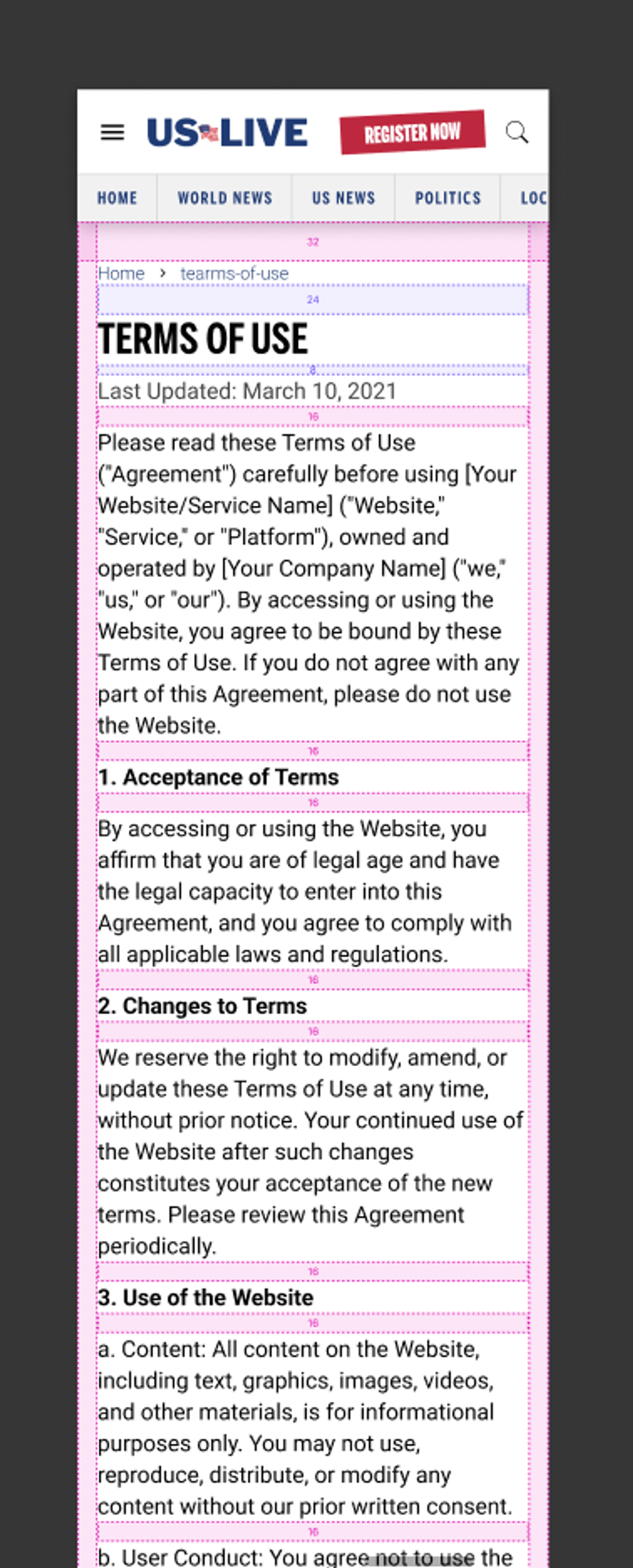
We use Figma's "Outline" plugin to apply visual details to each frame, making it easy for developers to understand the design system when implementing it.
Conclusion
By adhering to our design requirements and guidelines, you will be contributing to the visual consistency and quality of our projects.
If you have any questions or need clarification on any of these points, please do not hesitate to reach out to our design team lead or your project manager for assistance.
Thank you for your dedication to delivering outstanding designs to RebelMouse!


