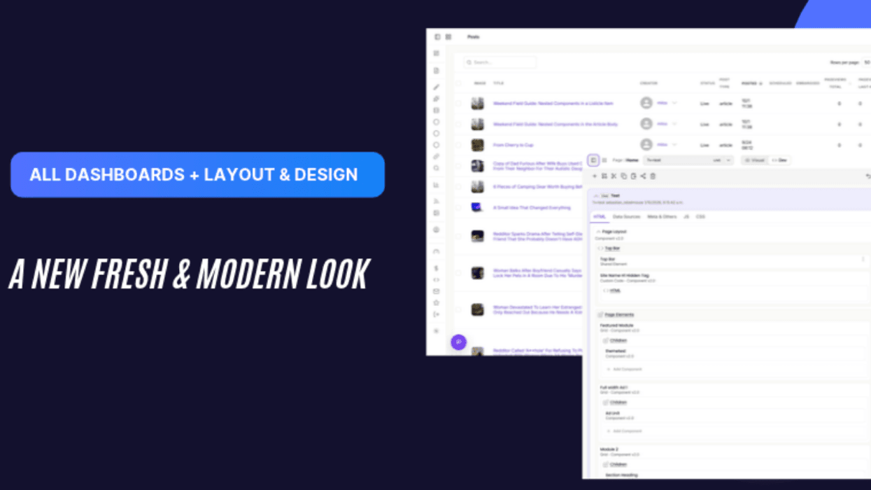

This Thursday, the 5th of November, we are launching our new Dashboard and Layout and Design Tool, which now share a new unified and modern design system. Nothing changed in terms of functionality. Only colors, type, icons, controls and navigation were updated.
Why you will like it
- Easier to read. A calmer palette, clearer text hierarchy, a single line-icon set and proper labels on every field reduce visual noise.
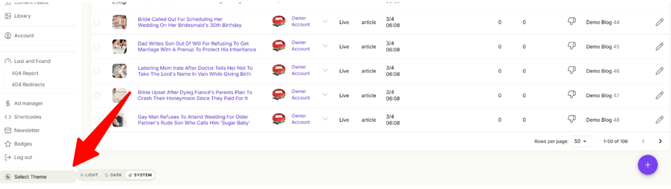
- Light, Dark or System. Change to dark mode or follow your system’s preferences to work more comfortably. It follows you across apps and tabs, and the whole UI, adapts.
- More room for your work. The left menu starts collapsed as a compact icon rail and expands on demand, so tables get the full width but at the same time you can navigate quicker.
- Accessible by default. Visible focus rings, stronger contrast and labelled icon buttons.
What changed
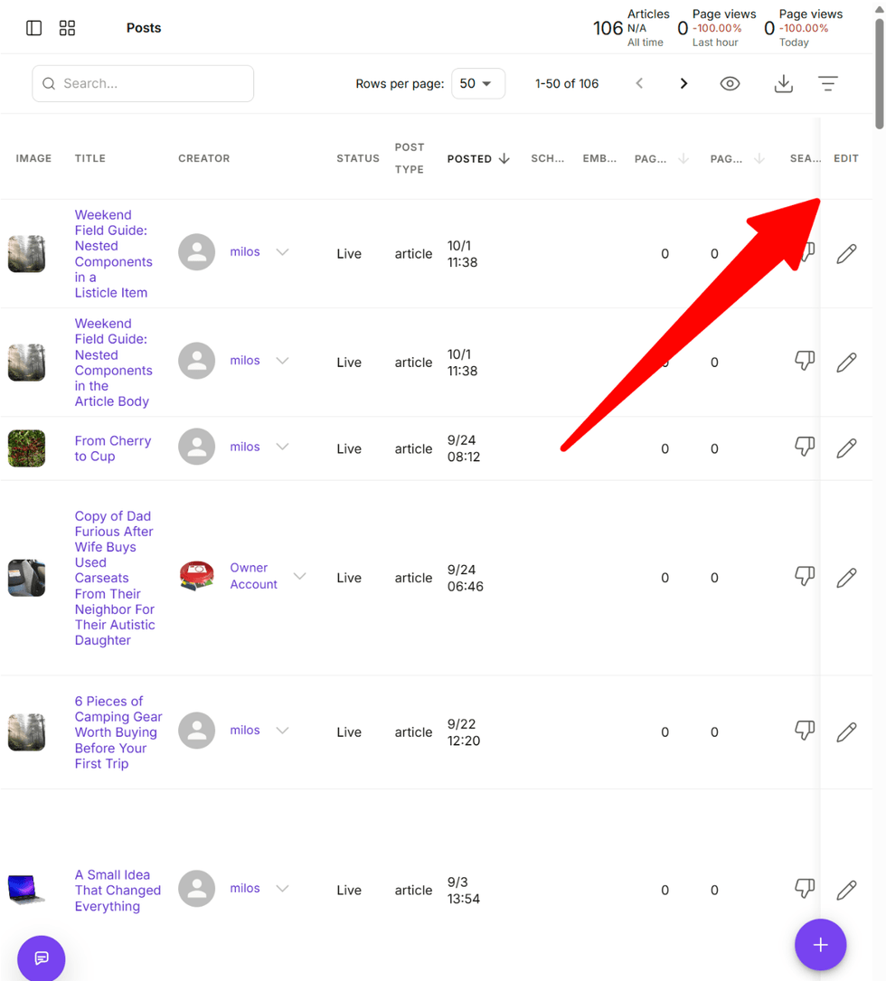
- Tables and lists. Posts table with sticky horizontal scrollbar & edit button always visible, tidier columns and less default clutter. Framed tables with column lines in Layout and Design.
- Form controls. Labels now sit above fields, with consistent hints, error states, checkboxes, tag inputs and dropdowns. Search boxes share one style everywhere.
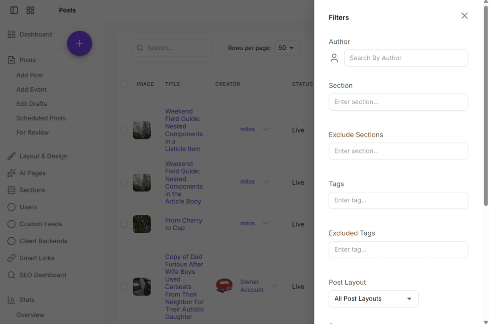
- Light, Dark or System Picker. Scroll to the bottom of the sidebar to choose your theme.
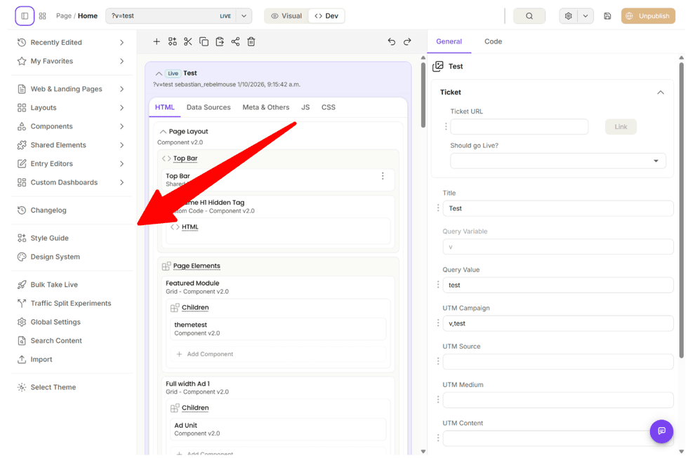
- Layout and Design editor. Redesigned rail tabs, Visual / Dev view switch, toolbar and publish split button, inline banners and layout tabs in a card.
Feel free to try it out appending a ?channel=alpha query param on Posts Dashboard or in Layout & Design Tool.
Important Note: Entry Editor was also redesigned but its deployment will happen in a later release.


