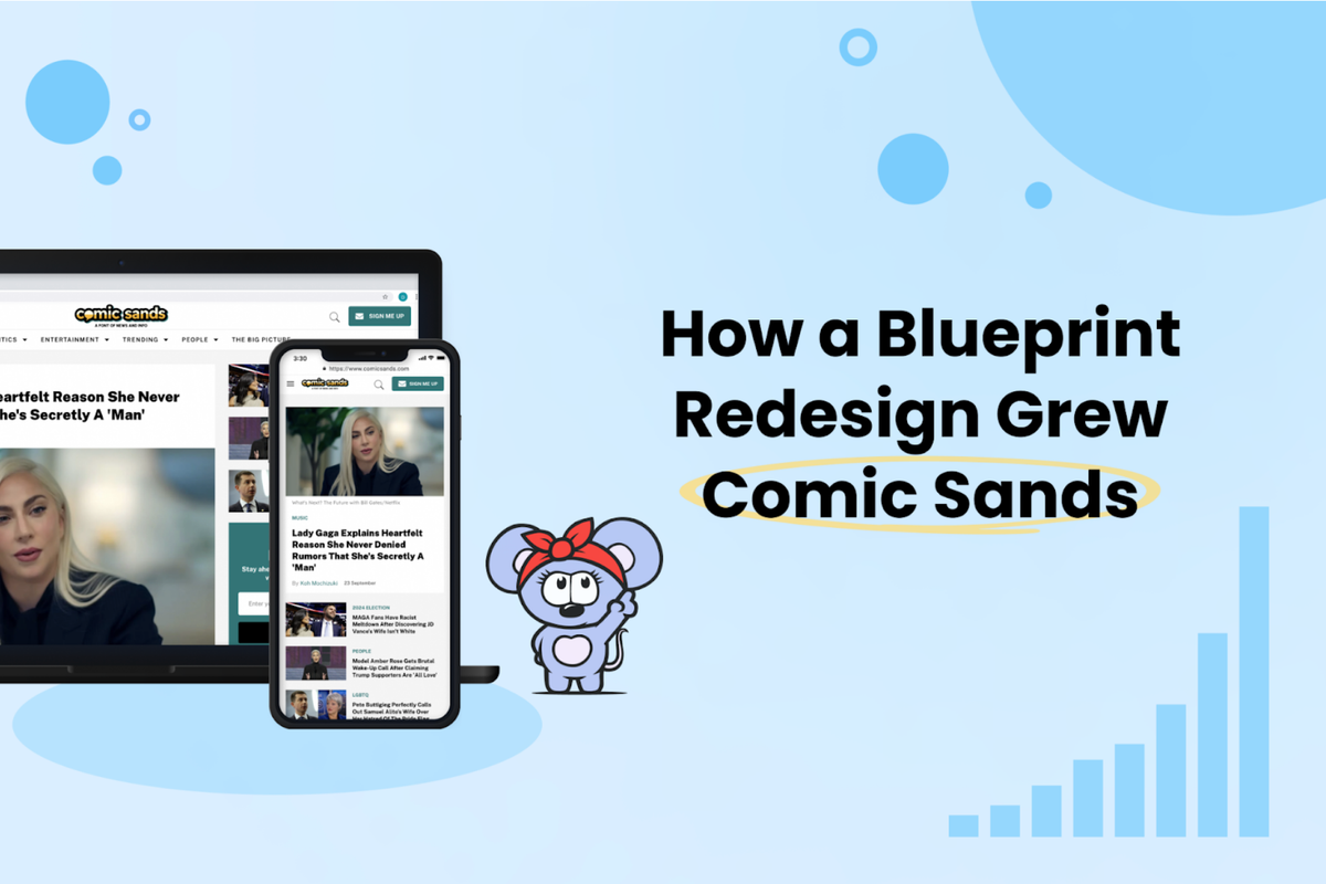
Another RebelMouse-powered site is seeing amazing results after a Blueprint redesign. Comic Sands, which playfully uses the tagline “we‘re a font of news and information,” has seen its traffic skyrocket since its redesign in mid-July 2024. Comic Sands follows The Fulcrum in experiencing a surge of success after a redesign.
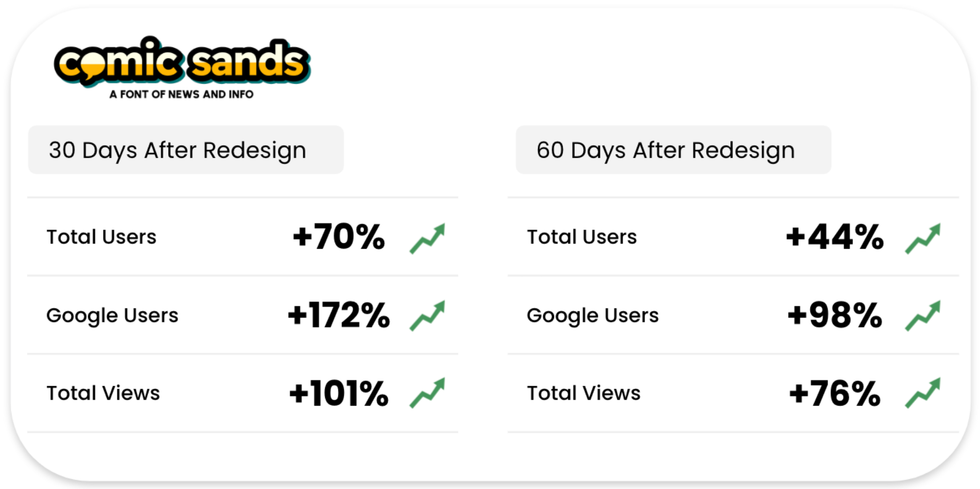
The website, under The Social Edge Network umbrella along with George Takei’s official website, is popular for its coverage of trending news, from Reddit to “pointless celebrity Twitter wars.” After the launch of the new design, Comic Sands’ 30-day average daily revenue increased by 79% and the site saw a remarkable 44% growth in users with a 76% increase in sessions in the 60 days that followed the redesign. Google traffic has approximately doubled (total users) and Google referral pageviews are up 44%.
Key engagement metrics are also showing impressive growth. Notably, engagement time per user is up 61% and views per user are up 22% (three views per user, a nice milestone). The site’s improved taxonomy and new recirculation modules are certainly part of that growth, too.
The old saying goes that a rising tide lifts all boats, and Comic Sands has experienced growth across the board — from Google to Facebook, Threads to X, everything is up since the redesign. That goes for total users, pageviews, and engagement metrics for each platform, making the site’s overall growth all the more remarkable.
The increases are not limited by device, either, with a 45% increase in mobile users and a 49% increase in desktop users in the 60 days since the redesign launched (compared to the previous 60 days).
A New Logo
The new look marked the opportunity to introduce a new logo. Comic Sands is such a fun brand and we wanted the new logo to reflect that identity. Our design team provided several options until Comic Sands chose the one that they fell in love with.
NEW:
OLD:
New Design
Improved Taxonomy
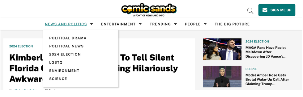
The redesign represented an opportunity to totally rethink Comic Sands’ taxonomy. They create so much great content, but it’s really diverse and it’s important that everything has a proper home and the website is easy for users to navigate.
The old site had three “News” categories — News, Weird News, and Funny News, which may have been confusing to users. It had “Politics” and “Entertainment” sections as well.
The new site introduced a “News and Politics” dropdown with:
- Political Drama for controversial content and feuds between individuals
- Political News for straight-up politics
- 2024 Election for coverage related to the important U.S. general election season
- LGBTQ, Environment, and Science subsections
An “Entertainment” dropdown with:
A “Trending” dropdown for:
And a new “People” dropdown for its extensive coverage of key individuals (subject to change over time) like Donald Trump, Elon Musk, Kamala Harris, and Taylor Swift.
They added a link to “The Big Picture,” another great initiative from their company, and the new taxonomy was complete. This new and improved navigation is great for the user experience, and it certainly helps to increase pageviews and time on site. We were so excited about it that we rolled it out before the full redesign was in place and it looks even better with the redesigned Blueprint site.
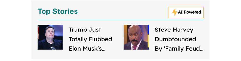
New Recirculation Modules
We introduced multiple recirculation modules along with the new Blueprint design, including:
Top Stories:
These appear in-body for posts, which leads to a high click-through rate — it’s an area where the user is engaged — and they’re designed to bring more visibility to Comic Sands’ best work. AI performs its magic to make sure the right stories are highlighted.
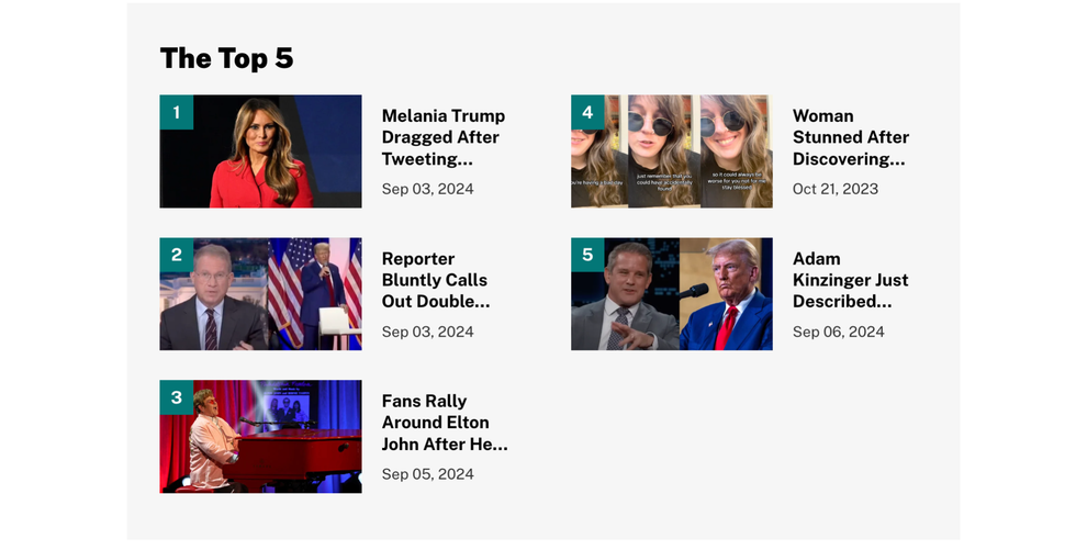
The Top 5:
At the end of every article, users will now find “The Top 5.” This is inspired by a Google News Initiative recommendation — actually number your top stories 1, 2, 3, 4, 5, which does a better job of getting a user’s attention and makes them feel like they “can’t miss out.” Any more than five and the module’s value dilutes, so five is a good number.
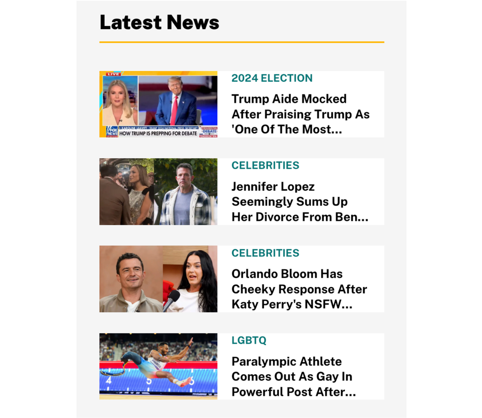
Latest News:
The “Latest News” module appears in the right rail of the desktop view. It’s what it sounds like — the latest content being published by Comic Sands, which also makes it clicky.
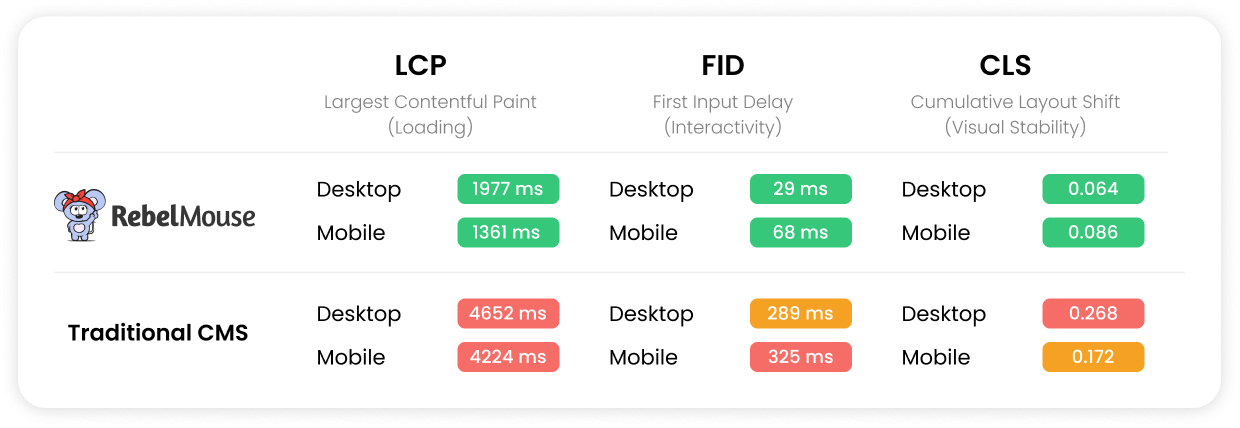
Perfect Core Web Vitals
The user experience was vastly improved with Comic Sands’ redesign, as the site is super fast and responsive. The following optimizations were made with Core Web Vitals in mind:
- Ultra-light JavaScript application; cleaned and optimized CSS and HTML
- Smart caching rules
- GZIP compression, which reduces file sizes by up to 85%
- A progressive web app (PWA) and a smart page load strategy
- Blueprints preload fonts and load images ahead of time for certain screen sizes depending on network speeds
Better Home Page Flow
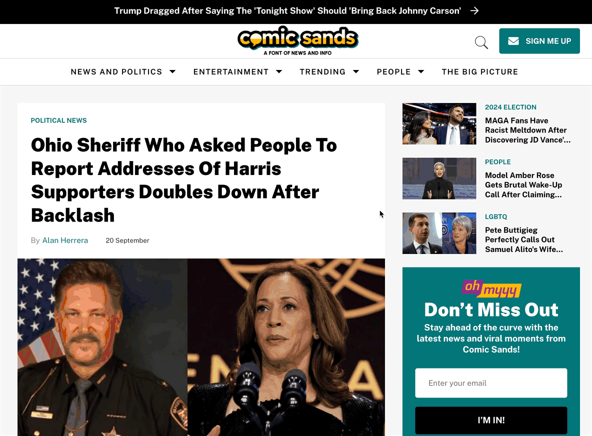
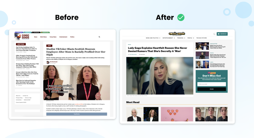
A prominent lead story with three top stories at the top, the home page flows logically into “Most Read” pieces of content, followed by the latest stories in the News & Politics, Entertainment, and People sections. Rich thumbnails appear alongside every thumbnail, enhancing user experience. It’s a nice improvement compared to the old home page which was entirely chronological based and had text-only headlines. The new design gives users the ability to more effectively browse the site’s best content and make choices about where they’d like to go next.
Merging of Second Nexus
Comic Sands already produces a steady stream of great content daily.
However, prior to the redesign, our Strategy team recommended that another Social Edge site, Second Nexus, would make more sense to merge into Comic Sands rather than live as a standalone site.
We completed this migration to coincide with the launch day of the new Comic Sands. It led to additional content on Comic Sands and our team worked closely with them to map it properly into the Comic Sands taxonomy. Redirects from the old site to the new one passed link juice properly, ensuring that the migration occurred flawlessly from a user’s perspective.
Our Strategy team regularly looks for opportunities such as these to improve the efficiency of editorial teams and ultimately grow one’s web presence whenever possible. The merging was a great success and further enhanced the comprehensiveness of Comic Sands’ content. We can’t wait to see where Comic Sands goes from here.
Would you like to see how our new Blueprints can supercharge your own website? Reach out today to get started!
- Premier Guitar Surges in Pageviews After Boost Spot Placement ... ›
- Case Study: EHN Site Redesign Leads to Growth and Engagement ... ›
- The Fulcrum Playbook: A Case Study in Traffic Growth - RebelMouse ›
- Diversify Traffic and Grow Revenue by Publishing News on MSN ... ›
- PowerToFly Surges in User Traffic Following Redesign - RebelMouse ›